Razr 5G external display update
The evolution of the Razr’s external display experience.
In the ever-evolving landscape of mobile technology, the launch of the Razr 5G marked a significant leap forward. The introduction of the new external display interface sparked a demand to enhance the original lock screen experience, driven by valuable user feedback. This case study delves into our journey to redefine and elevate the user experience, focusing on clarity, accessibility, and aesthetic cohesion.
Design objective
Our design objective was clear: strengthen the external display to align with the cutting-edge features of the Razr 5G. Recognizing the need for increased functionality, we aimed to provide users with more panel shortcuts on the home screen. Key additions, such as calendar and weather panels, were strategically integrated to foster rapid access and create a harmonious relationship between the opened and closed phone experiences. The biggest challenge lay in ensuring a fluid transition between states — locked and unlocked — while meeting user expectations and maintaining aesthetic coherence.

The existing locked screen was highly dissonant from the new UI proposal for the unlocked experience. One of the most significant challenges was to create a smooth transition from one state to the other.
1. Main screen
2. Single notification
3. Grouped notifications
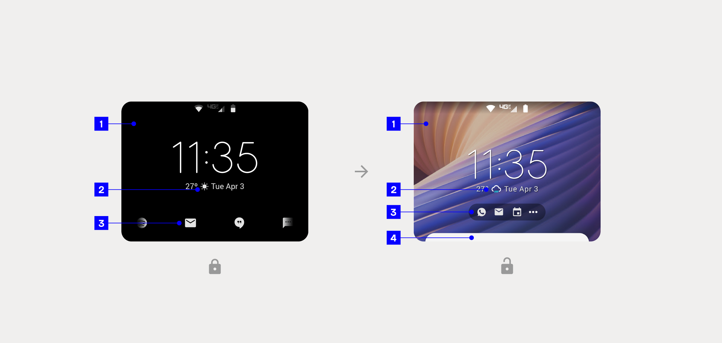
1. The absence of a wallpaper made it clear that the user was on the lock screen, but there was a lack of personalization.
2. Single-color weather icons on the lock screen were not standing out.
3. The design and navigation of notifications were causing confusion for the user when switching between states.
4. The addition of a notification peek helped the user understand the swipe-up gesture on the unlocked screen.

1. On the lock screen, notifications were very minimal. In contrast, notifications in the unlocked state used a card design, following the well-known look and feel present in most devices.
2. Notifications carousel for selecting individual messages.
3. Swipe up: on the lock screen, once the user taps and holds an icon to peek at a notification, they should swipe up to interact with the notification. Swiping up in the unlocked state pulls up a panel with all notifications. The user can scroll to navigate them and use call-to-action buttons to, for example, reply.
4. Canned messages for quickly replying.
Solution
Addressing the disparity between the existing Always-On Display (AOD) on the external screen and the new home screen interface, our focus was on eliminating confusion for the user. Leveraging insights into user behavior, we meticulously redesigned the locked screen experience, utilizing the unlocked interface as a foundation. The introduction of a seamless transition, coupled with motion design, not only connected both interfaces but also minimized distractions and enhanced user understanding of their device's state.
Motion design seamlessly connected both states, minimizing confusion.
1. Locked background now has a blurry version of the homescreen wallpaper making a cohesive design and a gradual transition from one state to the other.
2. Lock icon
3. Same widget on locked and unlocked states.
4. Caroussel kept the same aesthetic from the notification bar on homescreen (unlocked): one color icons over an overlayed shape.

1. Notification peek
2. Notification expanded with CTA buttons.
1. The new notification carousel introduces a delightful animation to display additional and incoming notifications to the user.
2. The notification peek is now accessible through the new carousel with a simple tap. The motion UI makes the transition feel more natural and intuitive.
The incorporation of easy access to agenda and weather on the external display brought significant value to users, providing pertinent information without distraction. Tackling the challenge of displaying relevant calendar information, we implemented a minimal yet useful approach, offering three panel options: monthly, daily, and events only. A continuous scroll feature ensured a smooth experience, even on smaller devices.
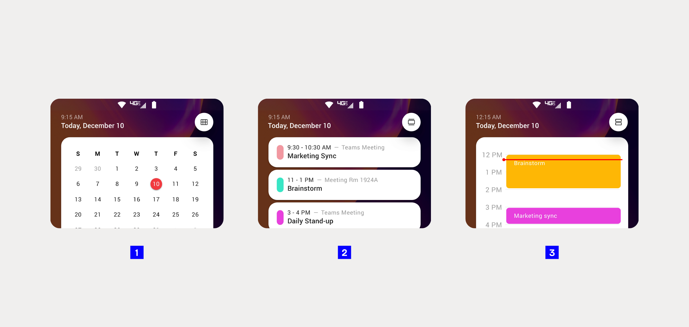
1. Monthly view
2. Event view
3. Daily view
1. A continuous scroll allows users to access future and past events.
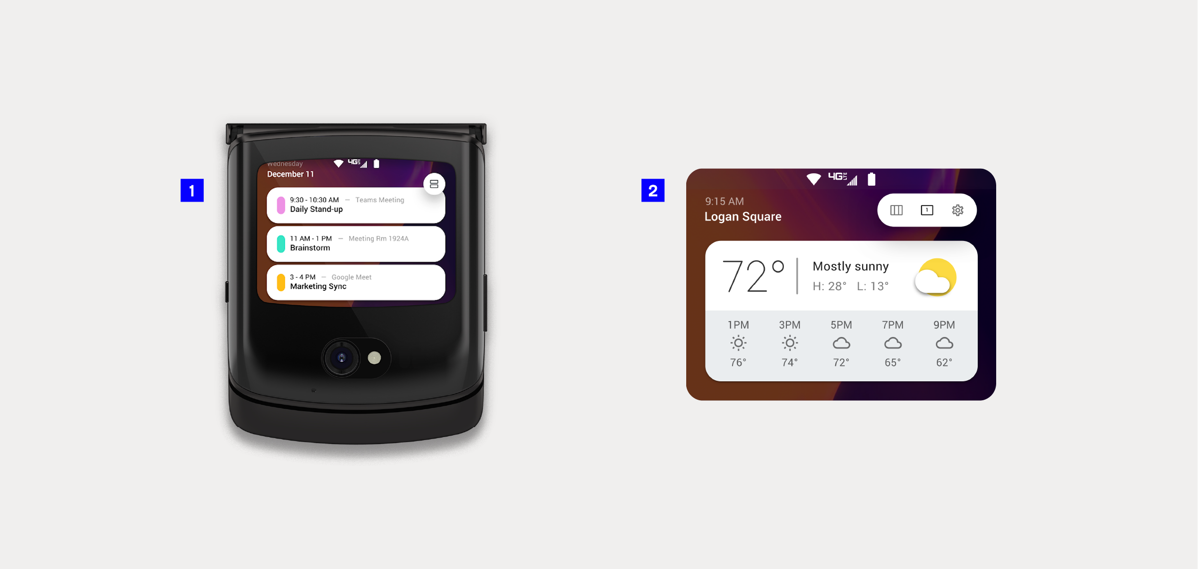
2. A convenient daily weather panel view for users to quickly check the forecast.
To manage the additional panels effectively, we introduced an intuitive "bench" mechanism. Users could effortlessly drag and drop features, maintaining the mental model established when the phone is open. Our goal was to empower users to find balance in their phone usage, extending the ease of life seamlessly to the external display.
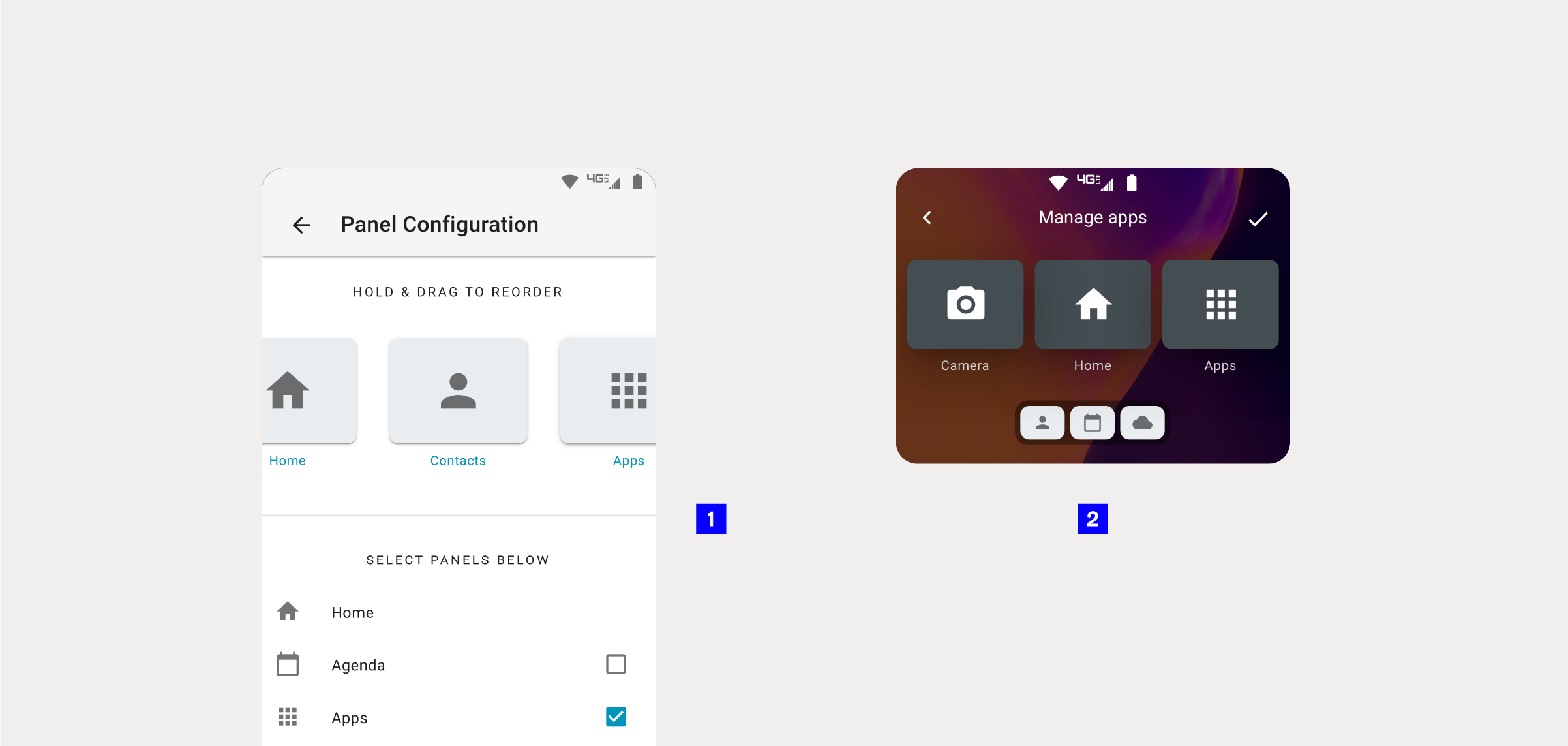
To manage the additional panels effectively on a small display, we introduced an intuitive “bench” mechanism.
1. The interface proposed for the large internal display used a list and checkboxes to add and remove panels to the external display.
2. My proposal was to redesign this experience, avoiding long lists or options off-screen. The use of drag-and-drop gestures and a bench featuring smaller versions of the panel cards created a more holistic experience.
Results
With the updated external display, users can now find more balance and convenience in their phone usage. The external display has evolved to the next level, reflecting a commitment to empowering users with a seamless and intuitive interface. This update not only meets user expectations but exceeds them, setting a new standard for mobile interaction with the Razr 5G.


