Razr 5G external display update
The evolution of the Razr’s external display experience.
Experience design, visual design, motion interface
quick INTRO
A screen worth a second look
When Motorola launched the Razr 5G, it redefined what an external display could be. But with innovation came new expectations: users wanted an external screen that wasn’t just functional, but fluid, personal, and consistent with the phone’s sleek interior UI. This case study is the story of how we reimagined the experience — making it clearer, more intuitive, and more delightful.
YEAR
2021
COMPANY
MOTOROLA
AGENCY
IN HOUSE (CXD)
ROLE
EXPERIENCE DESIGN
VISUAL DESIGN
MOTION UX
CREDITS
KATHRYYN THOMAS
BERT TISCH
TIM MIES
CXD RESEARCH TEAM
MOTOROLA DEVELOPMENT TEAM
STATUS
CONCEPT AND DESIGN APPROVED
The challenge
Listening to users, defining the challenge
The original external display felt limited compared to the potential of the Razr 5G. Users wanted quick access to essential information—calendar updates, weather forecasts, notifications—without needing to flip open the phone. At the same time, the existing lock screen design felt disconnected from the more advanced home screen experience inside. The challenge was clear: create a unified and fluid transition between locked and unlocked states while enhancing functionality and avoiding confusion.
The biggest challenge? Bridging the gap between two worlds — locked and unlocked — without breaking the flow.

Goals
Designing for flow, not friction
Our goal was to make the external display not just a window into the phone, but a cohesive extension of the Razr 5G experience.
We set out to:
• Strengthen the lock screen to align with the cutting-edge interior UI.
• Introduce more functionality: calendar, weather, richer notifications.
• Create a smooth, motion-driven transition between lock and unlock states.
• Balance aesthetic cohesion with usability, even on a smaller screen.

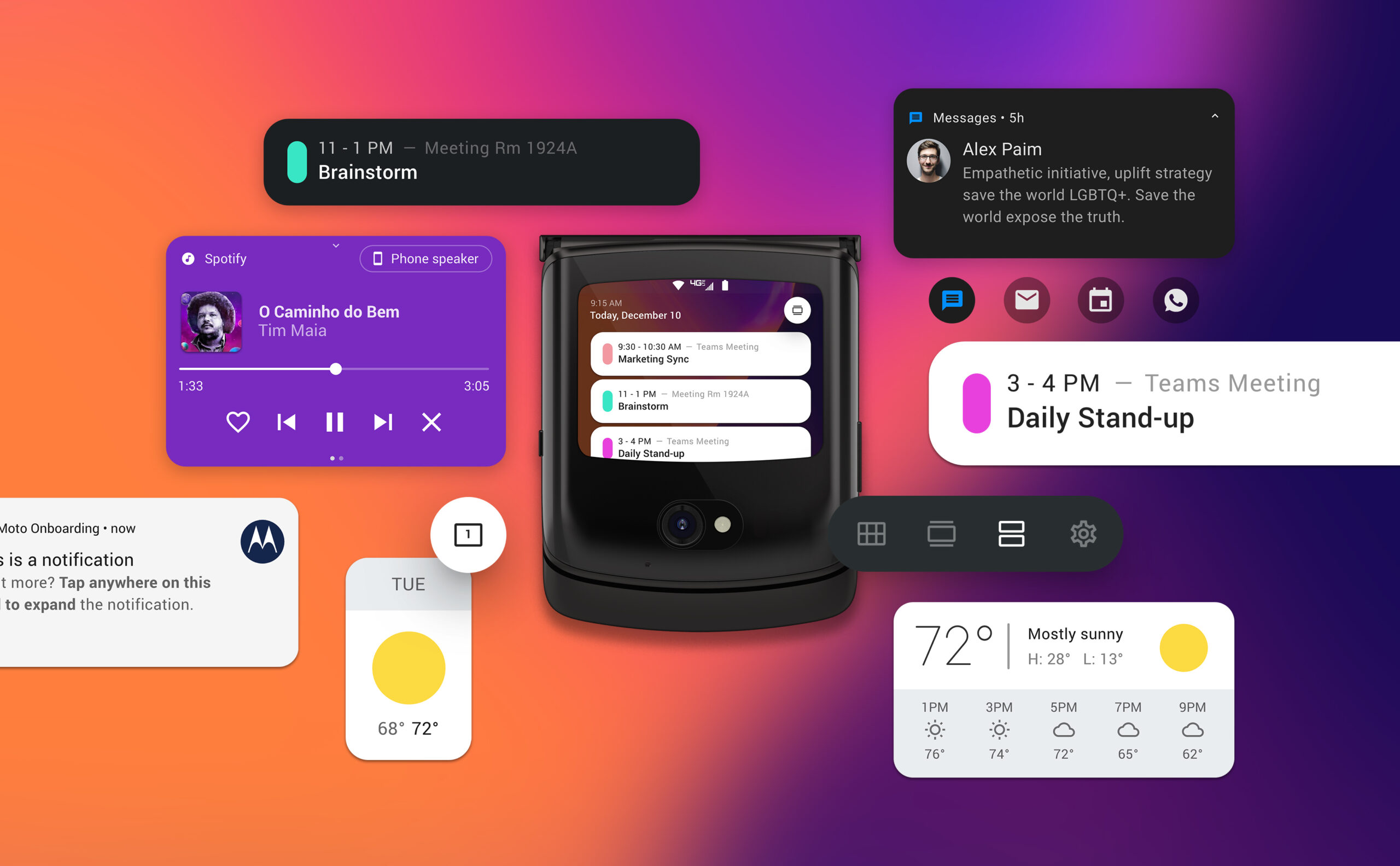
THE EXISTING LOCK SCREEN FELT DISCONNECTED FROM THE UNLOCKED EXPERIENCE. ONE OF THE BIGGEST CHALLENGES WAS CREATING A SMOOTH, NATURAL TRANSITION BETWEEN THE TWO STATES.
1. MAIN SCREEN
2. SINGLE NOTIFICATION
3. GROUPED NOTIFICATIONS
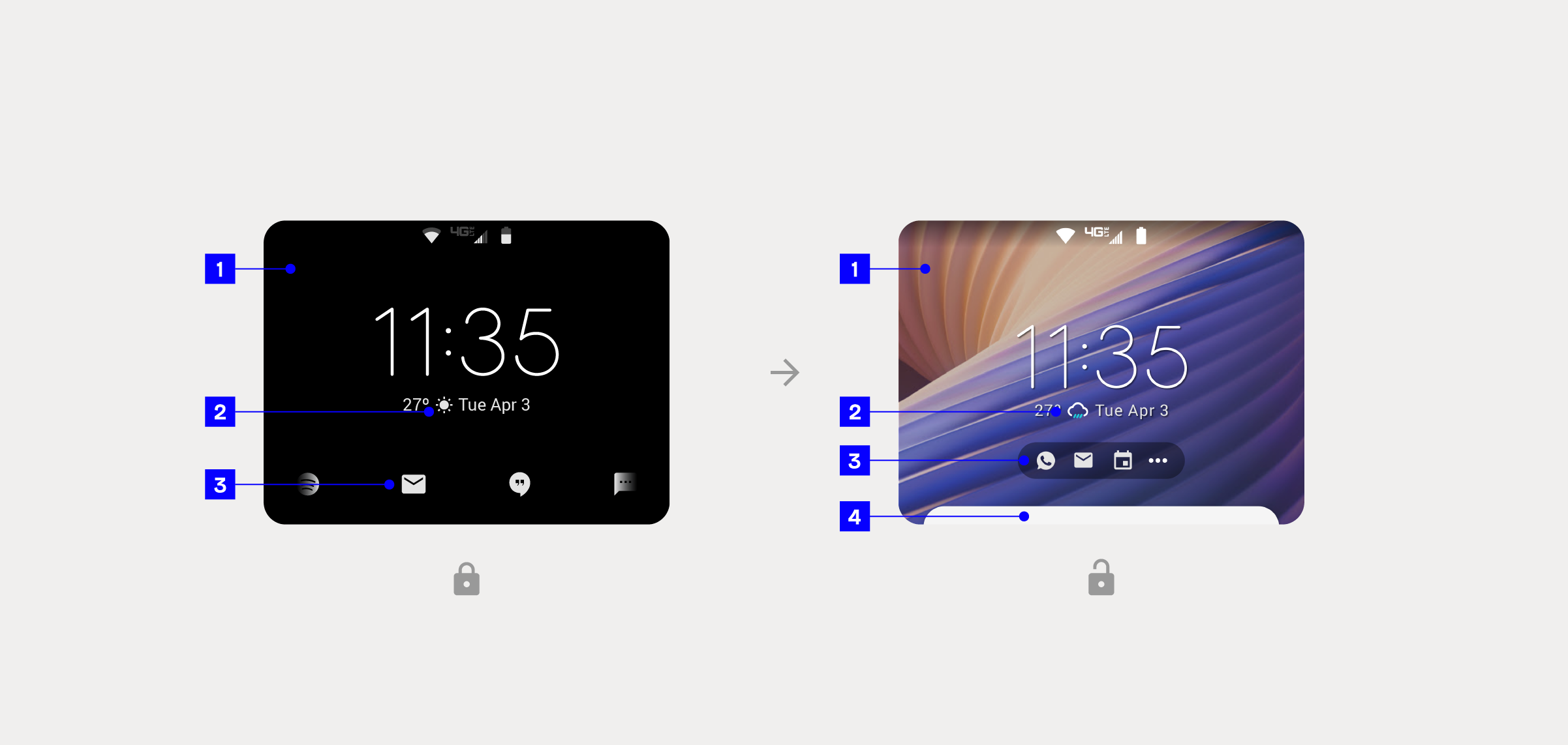
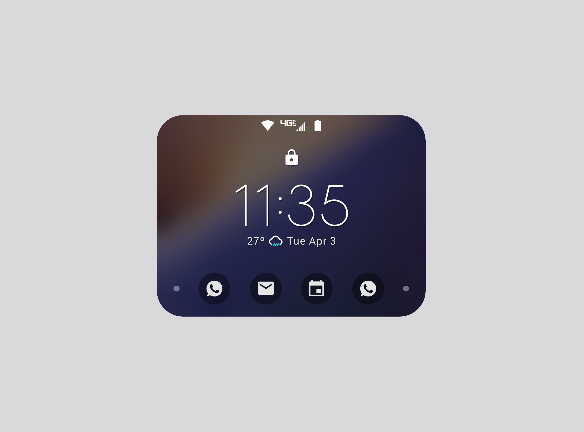
1. WALLPAPER — THE ABSENCE OF A WALLPAPER MADE IT CLEAR THAT THE USER WAS ON THE LOCK SCREEN, BUT IT ALSO CREATED A LACK OF PERSONALIZATION.
2. WEATHER ICONS — SINGLE-COLOR WEATHER ICONS ON THE LOCK SCREEN DID NOT STAND OUT ENOUGH.
3. NOTIFICATIONS — THE DESIGN AND NAVIGATION OF NOTIFICATIONS CAUSED CONFUSION WHEN USERS SWITCHED BETWEEN STATES.
4. NOTIFICATION PEEK — THE ADDITION OF A NOTIFICATION PEEK HELPED USERS BETTER UNDERSTAND THE SWIPE-UP GESTURE ON THE UNLOCKED SCREEN.

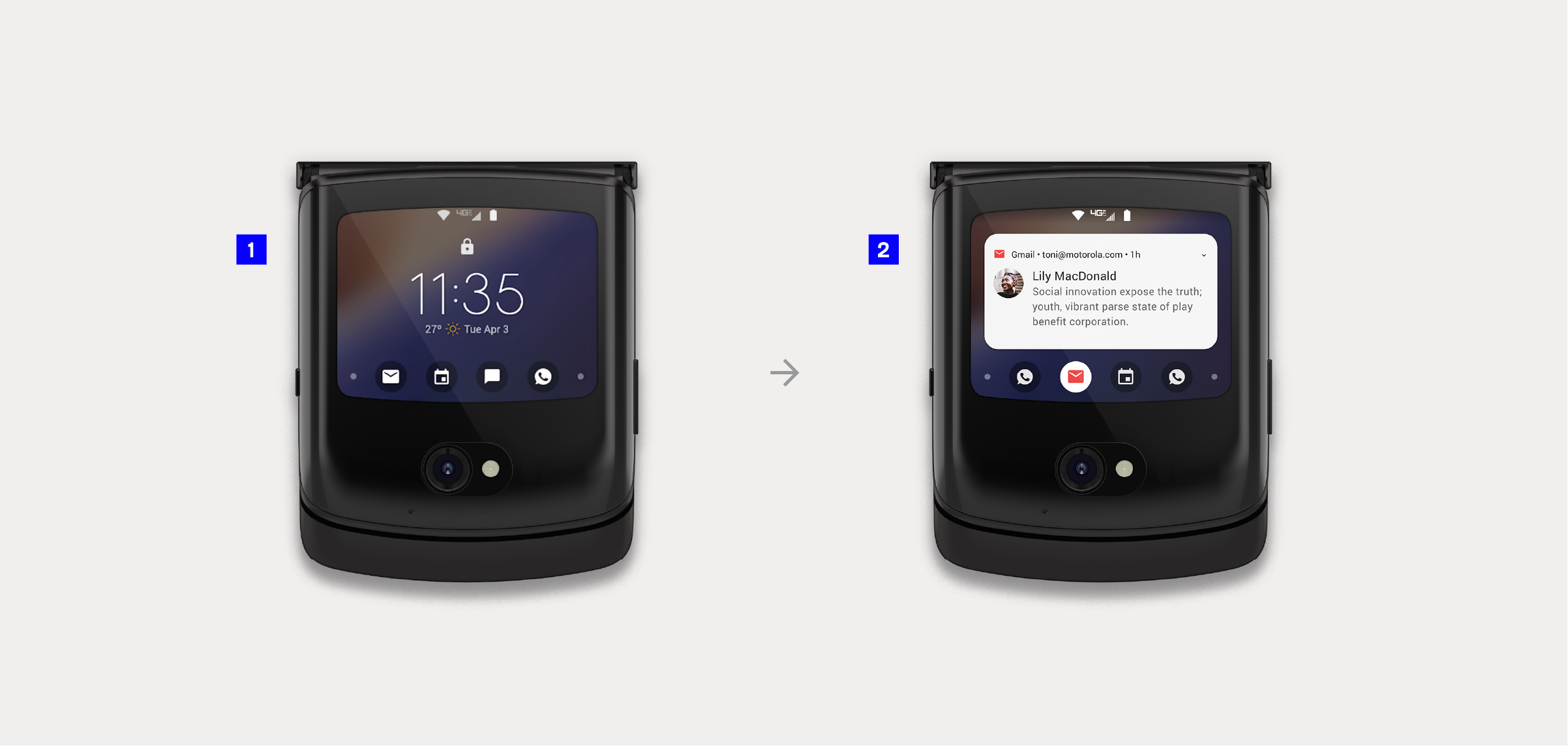
1. ON THE LOCK SCREEN, NOTIFICATIONS WERE VERY MINIMAL. IN CONTRAST, NOTIFICATIONS IN THE UNLOCKED STATE USED A CARD DESIGN, FOLLOWING THE FAMILIAR LOOK AND FEEL FOUND IN MOST DEVICES.
2. A NOTIFICATIONS CAROUSEL ALLOWED USERS TO SELECT INDIVIDUAL MESSAGES.
3. SWIPE UP — ON THE LOCK SCREEN, ONCE A USER TAPPED AND HELD AN ICON TO PEEK AT A NOTIFICATION, THEY COULD SWIPE UP TO INTERACT WITH IT. IN THE UNLOCKED STATE, SWIPING UP PULLED UP A FULL PANEL WITH ALL NOTIFICATIONS, WHERE USERS COULD SCROLL AND USE CALL-TO-ACTION BUTTONS, SUCH AS REPLYING.
4. CANNED MESSAGES ENABLED QUICK REPLIES.
Strategy and direction
Building a story of continuity
We leaned on one guiding principle: continuity builds confidence. If the transition between locked and unlocked felt natural, users would instantly trust the experience. We noticed that the biggest friction point came from the visual dissonance: the locked state looked and felt drastically different from the unlocked experience. Notifications behaved inconsistently, and the lack of a wallpaper on the lock screen signaled “you are here,” but stripped away any sense of personality. Our strategy was to align both states visually, leaning on motion and interaction design to connect them in a way that felt effortless.

MOTION DESIGN SEAMLESSLY CONNECTED BOTH STATES, MINIMIZING CONFUSION.
1. THE LOCKED BACKGROUND NOW FEATURES A BLURRED VERSION OF THE HOMESCREEN WALLPAPER, CREATING A COHESIVE DESIGN AND A GRADUAL TRANSITION BETWEEN STATES.
2. LOCK ICON.
3. THE SAME WIDGET APPEARS IN BOTH LOCKED AND UNLOCKED STATES.
4. THE CAROUSEL MAINTAINED THE SAME AESTHETIC AS THE HOMESCREEN NOTIFICATION BAR (UNLOCKED): SINGLE-COLOR ICONS PLACED OVER AN OVERLAID SHAPE.

1. NOTIFICATION PEEK.
2. NOTIFICATION EXPANDED WITH CTA BUTTONS.
1. THE NEW NOTIFICATION CAROUSEL INTRODUCES A DELIGHTFUL ANIMATION, MAKING IT EASIER FOR USERS TO VIEW ADDITIONAL AND INCOMING NOTIFICATIONS.
2. NOTIFICATION PEEK IS NOW ACCESSIBLE THROUGH THE CAROUSEL WITH A SIMPLE TAP, AND THE MOTION UI MAKES THE TRANSITION FEEL MORE NATURAL AND INTUITIVE.
Explorations and design decisions
Designing with small gestures in mind
We experimented with how far we could push the external display without overwhelming users. Motion design became an ally, creating a sense of continuity between states. A blurry version of the home screen wallpaper was introduced in the locked state, softening the transition while preserving clarity. Icons, widgets, and carousels were refined to speak the same design language, ensuring users always felt grounded in the same ecosystem—whether the phone was locked or unlocked.
Notifications, one of the most complex parts of the experience, were carefully reimagined. Instead of abrupt switches, we designed a carousel system that let users glide through messages with intuitive gestures. A “peek” interaction gave them a taste of what was coming without forcing a commitment, while quick-reply options made the interface not just functional but responsive to everyday needs.
We also faced the challenge of adding more panels without crowding the limited display space. To solve this, we designed a “bench” mechanism, letting users drag and drop features with ease. This playful but practical interaction echoed the Razr’s larger display experience, keeping the mental model consistent across the device.
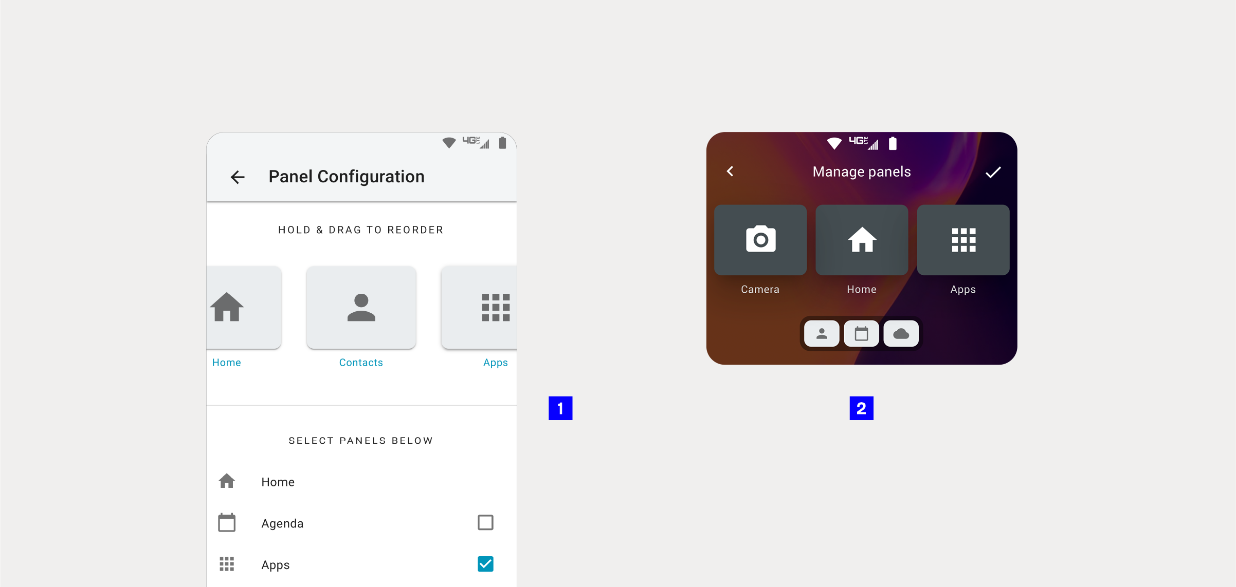
TO MANAGE THE ADDITIONAL PANELS EFFECTIVELY ON A SMALL DISPLAY, WE INTRODUCED AN INTUITIVE “BENCH” MECHANISM.
1. THE INTERFACE PROPOSED FOR THE LARGE INTERNAL DISPLAY RELIED ON A LIST AND CHECKBOXES TO ADD OR REMOVE PANELS ON THE EXTERNAL DISPLAY.
2. MY PROPOSAL WAS TO REDESIGN THIS EXPERIENCE BY AVOIDING LONG LISTS OR OFF-SCREEN OPTIONS. INSTEAD, I INTRODUCED DRAG-AND-DROP GESTURES AND A BENCH WITH SMALLER VERSIONS OF THE PANEL CARDS, CREATING A MORE COHESIVE AND HOLISTIC EXPERIENCE.
The solution
A seamless companion
The redesigned external display became more than a lock screen—it became a miniature hub of essential interactions. Motion smoothed transitions, personalization brought warmth, and new panels like weather and calendar added genuine utility. The Quick View Display no longer felt like a barrier but rather a welcoming entry point to the Razr experience. Users could glance, swipe, and act with confidence, enjoying a balanced rhythm between information and simplicity.
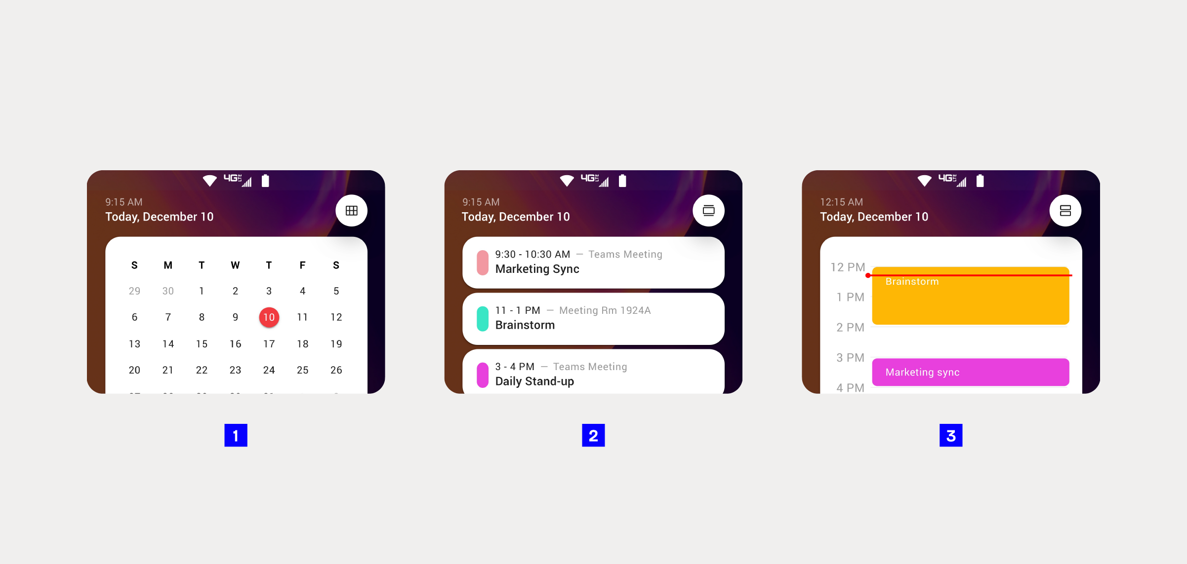
1. MONTHLY VIEW
2. EVENT VIEW
3. DAILY VIEW
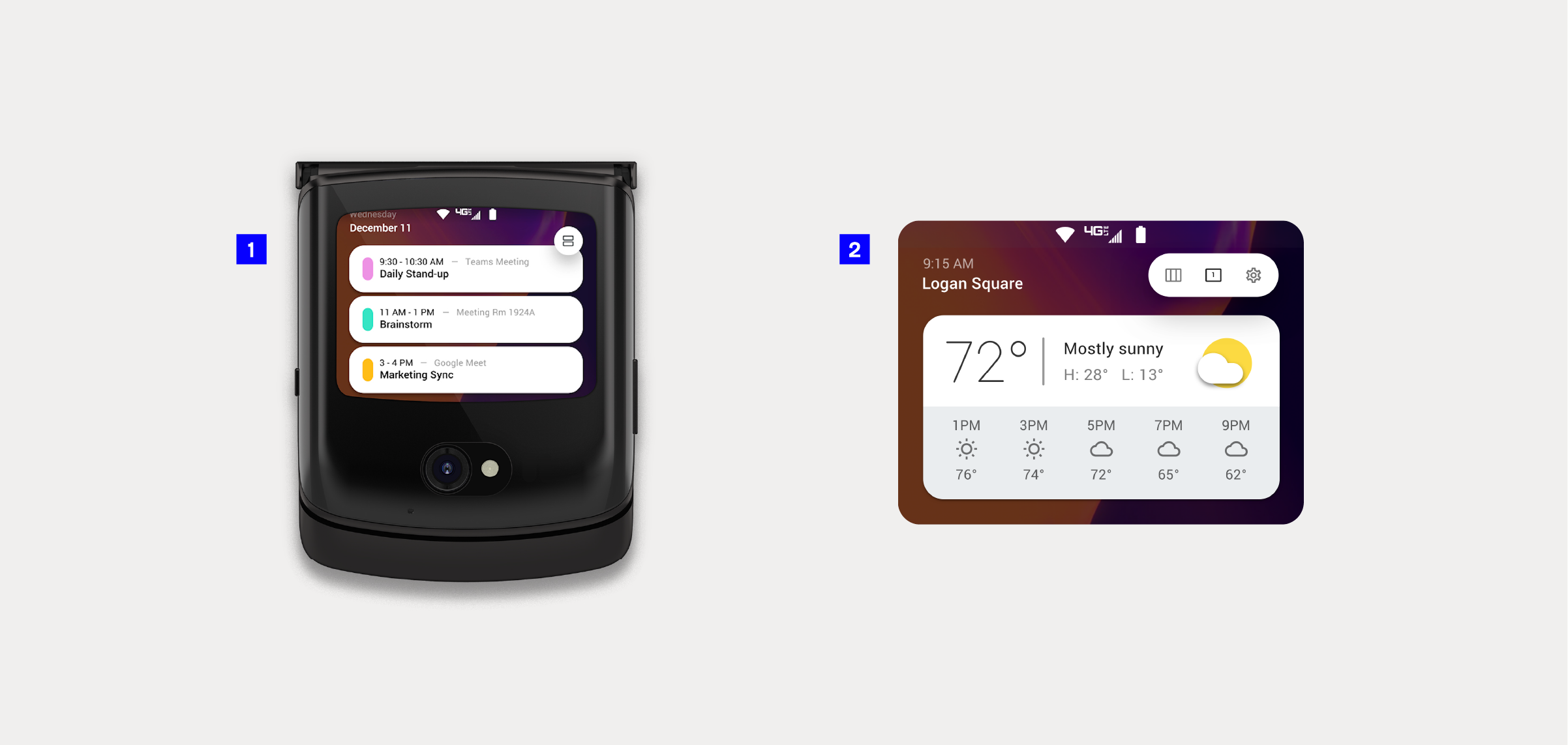
1. A CONTINUOUS SCROLL LETS USERS ACCESS BOTH FUTURE AND PAST EVENTS.
2. A CONVENIENT DAILY WEATHER PANEL ALLOWS USERS TO QUICKLY CHECK THE FORECAST.
Impact
More than a display
The evolution of the external display elevated the Razr 5G into a more complete and user-centered device. By addressing pain points and introducing thoughtful interactions, we exceeded user expectations, giving them not only what they asked for but something more intuitive, delightful, and cohesive. The result was a small but powerful shift: the external display transformed from a passive surface into an active extension of the Razr, redefining how people interact with their phones in the moments that matter most.
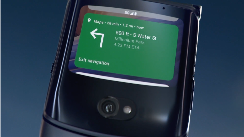
MUSIC PLAYBACK FLOWS EFFORTLESSLY FROM LOCK SCREEN TO UNLOCKED VIEW, KEEPING THE RHYTHM UNINTERRUPTED.
PROJECT GALLERY