OLLY VISUAL IDENTITY
A new eye on observability education.
Brand identity, logo design, art direction.

quick INTRO
Meet Olly
Olly is a new observability school in Brazil with a mission to make this complex field accessible, inclusive, and inspiring. My task was to craft a visual identity that not only stood out in a crowded space but also reflected the school’s values—clarity, collaboration, and growth. The result is a brand rooted in symbolism and built to connect with IT professionals at every stage of their learning journey.
YEAR
COMPANY
AGENCY
ROLE
TEAM
STATUS
2024
OLLY
FREELANCER
ART DIRECTION
BRANDING DESIGN
MOTION GRAPHICS
VISUAL DESIGN
—
CONCEPT AND DESIGN APPROVED
The challenge
A softer lens on observability
Observability, while critical in modern IT, often comes wrapped in technical jargon and intimidating visuals. Many brands in the field rely heavily on literal “human eye” imagery to convey the idea of watching, analyzing, and understanding. For Olly, the challenge was to create a symbol that was instantly recognizable in the observability domain yet distinct, approachable, and meaningful—something that would reflect the school’s educational focus and welcoming community.


Goals
Defining the objectives
• Create a distinctive, memorable logo that embodies vigilance, adaptability, and clarity.
• Establish a visual identity that communicates expertise without alienating newcomers.
• Support Olly’s mission of inclusive, clear, and collaborative communication.
• Set Olly apart from competitors using a fresh and thoughtful visual approach.


Strategy and direction
Turning “O” into a symbol
The design process began with a deep dive into the meaning of observability—understanding it not just as a technical concept, but as a skill that requires constant awareness and adaptability. From the start, I wanted to retain the symbolic power of the “eye” while steering away from overused designs.
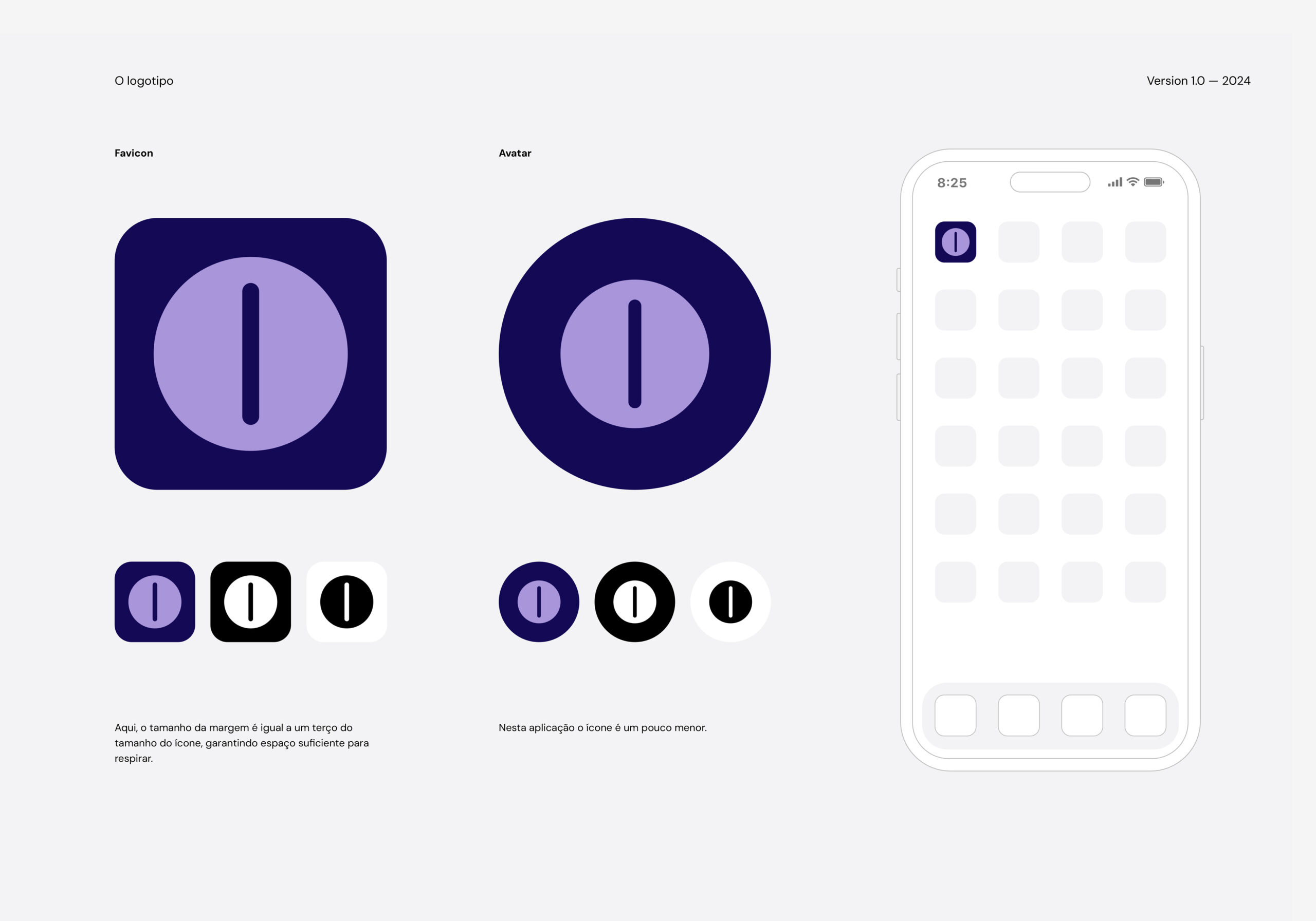
The creative direction focused on transforming the letter O from “Olly” into a slit eye—a visual choice inspired by nature. Slit pupils adapt to changing light conditions, representing vigilance, agility, and protection—perfect metaphors for IT professionals who must navigate both high-pressure situations and quieter periods of monitoring.
Explorations and design decisions
Shaping the vision
Early sketches explored several eye variations before landing on the slit shape as the most unique and versatile option. Its symbolism extends beyond nature—it’s a motif in pop culture icons like The Lord of the Rings and Thundercats, where it represents all-seeing awareness.
A visual audit confirmed the saturation of human-eye icons in the observability space, reinforcing the decision to go with something fresh. The slit eye’s geometric form offered excellent scalability, working seamlessly across digital and print applications.
From there, I developed a brand system rooted in clarity and connection—clean typography, approachable colors, and a tone of voice that speaks directly, in plain language, to the audience.

The solution
All eyes on Olly
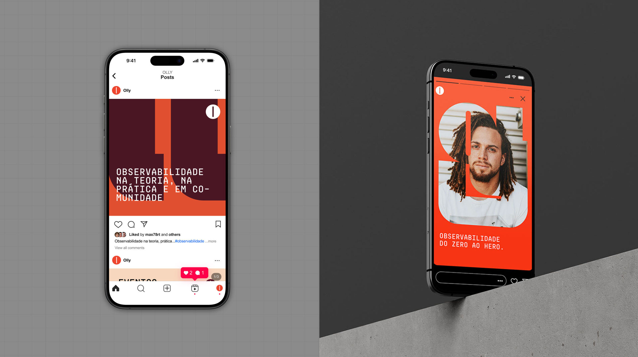
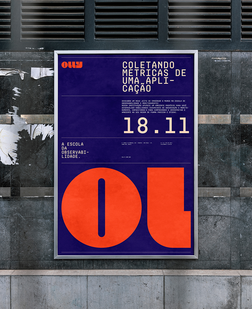
The final logo is a stylized slit eye integrated into the “O” of Olly, creating an immediate link between name and symbol. The design communicates vigilance without intimidation, curiosity without complexity.
Paired with a friendly color palette and a simple, conversational visual language, the identity reflects Olly’s mission: to make observability education approachable, collaborative, and inspiring.
Impact
Making an impression
The identity has been warmly received by Olly’s audience, who value its clarity, inclusivity, and originality. The slit eye stands out in a crowded market, offering a fresh visual narrative that is both functional and symbolic.
More than just a logo, the brand has given Olly a confident visual voice—positioning it as a welcoming, knowledgeable presence in the field of observability education. This project demonstrates how strategic design and thoughtful symbolism can elevate a brand’s presence while staying true to its core values.
AWARDS
Olly project has been selected to the 2024 Brazilian Biennial of Design.
BRAZILIAN BIENNIAL OF DESIGN
2024
PROJECT GALLERY