ETHOS DESIGN SYSTEM
The life-saving pixel.
DESIGN SYSTEM, ACESSIBILITY, HEALTHCARE UX, DESIGN OPS
quick INTRO
Intuitive. Intentional. Impactful.
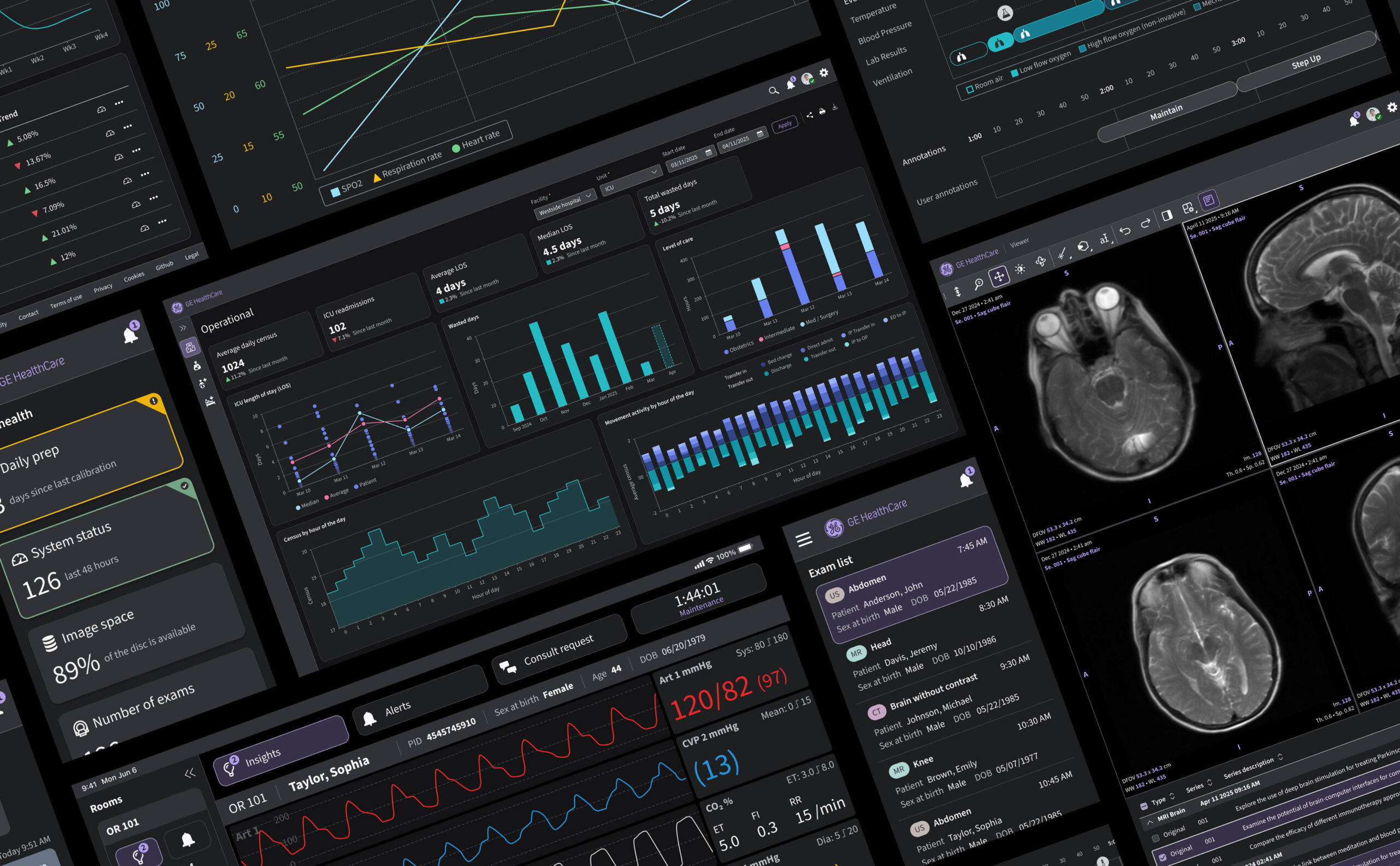
Picture an ICU at 2 AM. The lights are dim, alarms are sounding somewhere down the hall, and a clinician is moving between a patient monitor, an EHR system, and a device interface. Three screens, three different visual languages, all competing for the same sliver of attention. In that moment, an interface either amplifies stress or absorbs it.
That distinction is the whole premise behind the Ethos Design System. GE HealthCare's software portfolio spans more than 200 applications: imaging suites, patient monitors, diagnostic tools, cloud platforms, built over years by teams that rarely spoke to each other. Each had its own logic, its own visual grammar, its own way of asking a nurse to confirm a dose. None of that fragmentation showed up on a spec sheet. It showed up as a half-second of hesitation, repeated across thousands of clinicians, thousands of times a day.
EDS was built to close that gap. Not as a style guide layered on top of existing products, but as the shared visual foundation an entire portfolio could finally stand on. One recognizable language, flexible enough to work everywhere it needed to, familiar enough that nobody has to relearn it under pressure.
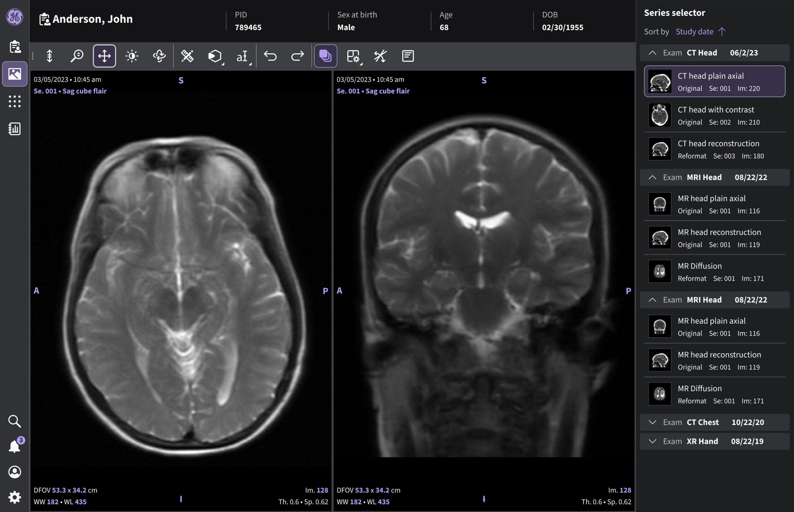
MRI INTERFACE — BUILT WITH ETHOS COMPONENTS
YEAR
COMPANY
AGENCY
ROLE
CREDITS
STATUS
2025
GE HEALTHCARE
IN HOUSE (EDS TEAM)
UX DESIGN
UX MOTION DESIGN
VISUAL DESIGN
ICON DESIGN
KEVIN YUDA
LINDSEY DUFOUR
CHRISTOPHER JANICKI
IRSHATH AHAMED KALEELURAHMAN
RASHI SHARMA
PRASAD ALURU
SANDHYA BUDDI
ANN TRUMBLE
RACHANA RACHAPROLU
SAVITHA DHIMAN
CONCEPT AND DESIGN APPROVED
MY ROLE
Set the visual language.
Defined the typography, iconography, motion, and color foundations now running across 100+ healthcare products in Imaging, Ultrasound, Patient Monitoring, and Pharmaceutical Diagnostics.
Designed the motion language.
Built the animation and interaction behavior across every component and interaction in the system, defining how transitions, feedback, and state changes move, not just how they look.
Built components for the library.
Contributed directly to the EDS component library, from spec through to shipped, tested across screen sizes from bedside monitors to desktop dashboards.
Authored the patterns and guidelines.
Wrote usage rules and documentation that let other teams build correctly with the system without needing to ask.
Closed the gap between design and code.
Partnered with engineering, product, and research to turn principles into production-ready components, so what shipped matched what was designed.
ETHOS DESIGN SYSTEM UI MOTION – ACTIVITY INDICATOR
The challenge
Every second counts
Cognitive overload in healthcare isn't just a UX inconvenience. It's a patient safety issue. The research is clear on the mechanism: when an interface forces a clinician to search for information, workload increases, and error risk climbs with it. Healthcare environments make this worse by default. High data density, constant interruptions, and alarm fatigue all stack on top of each other, and a clinician navigating them doesn't have the bandwidth to decode an unfamiliar layout.
The complexity compounds because no clinician lives inside a single interface. Over one shift, they move across bedside monitors, tablets, desktop systems, and shared displays, and everything changes with them. Screen size changes. Input changes, from touch to mouse to keyboard, sometimes through gloves. Lighting shifts from a dim ICU to a bright operating room. The obvious fix, one rigid interface everywhere, was never realistic across that much hardware and that many use cases. The harder, more honest goal was building one recognizable visual language that could flex across every context without asking anyone to relearn it.
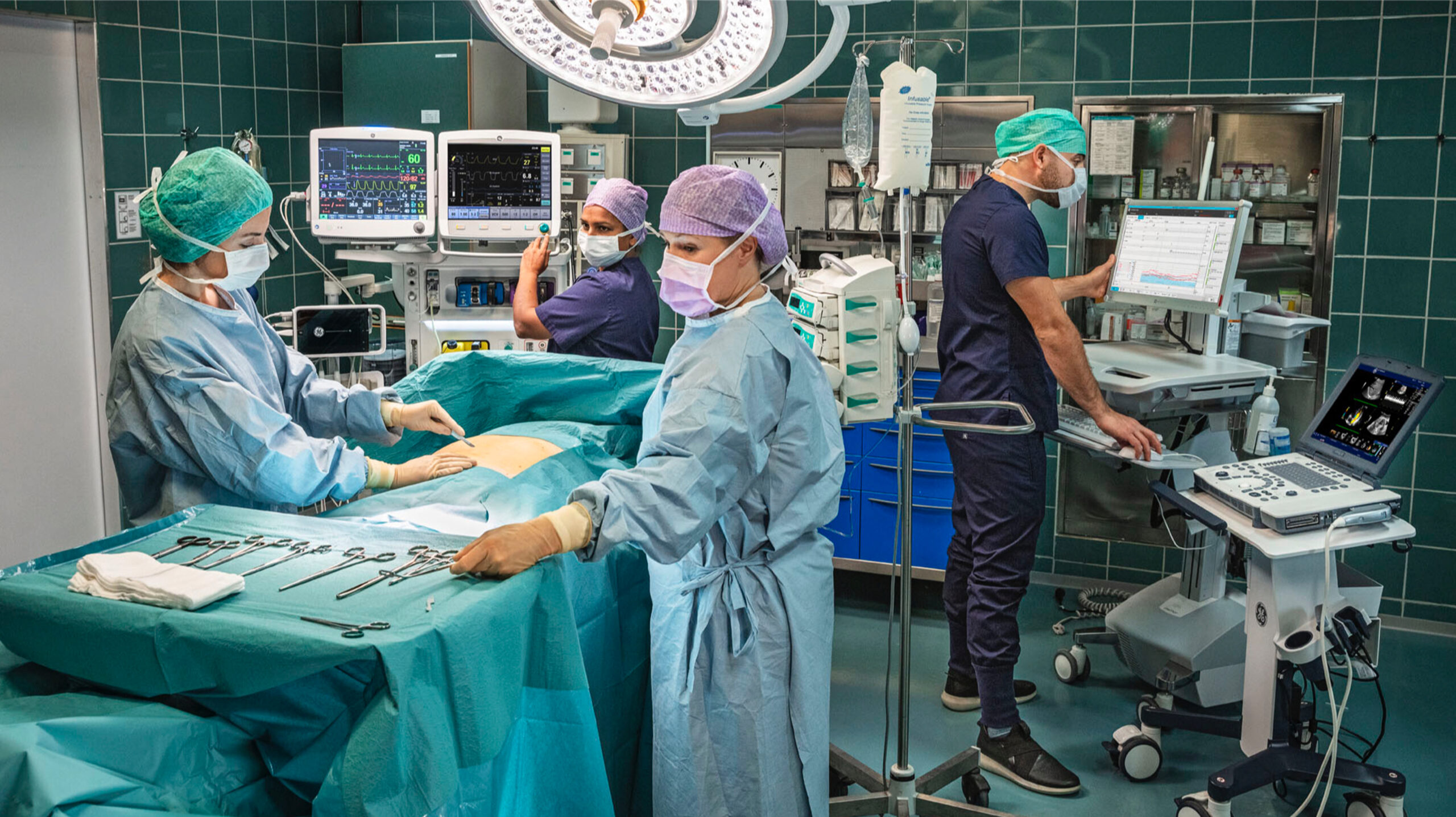
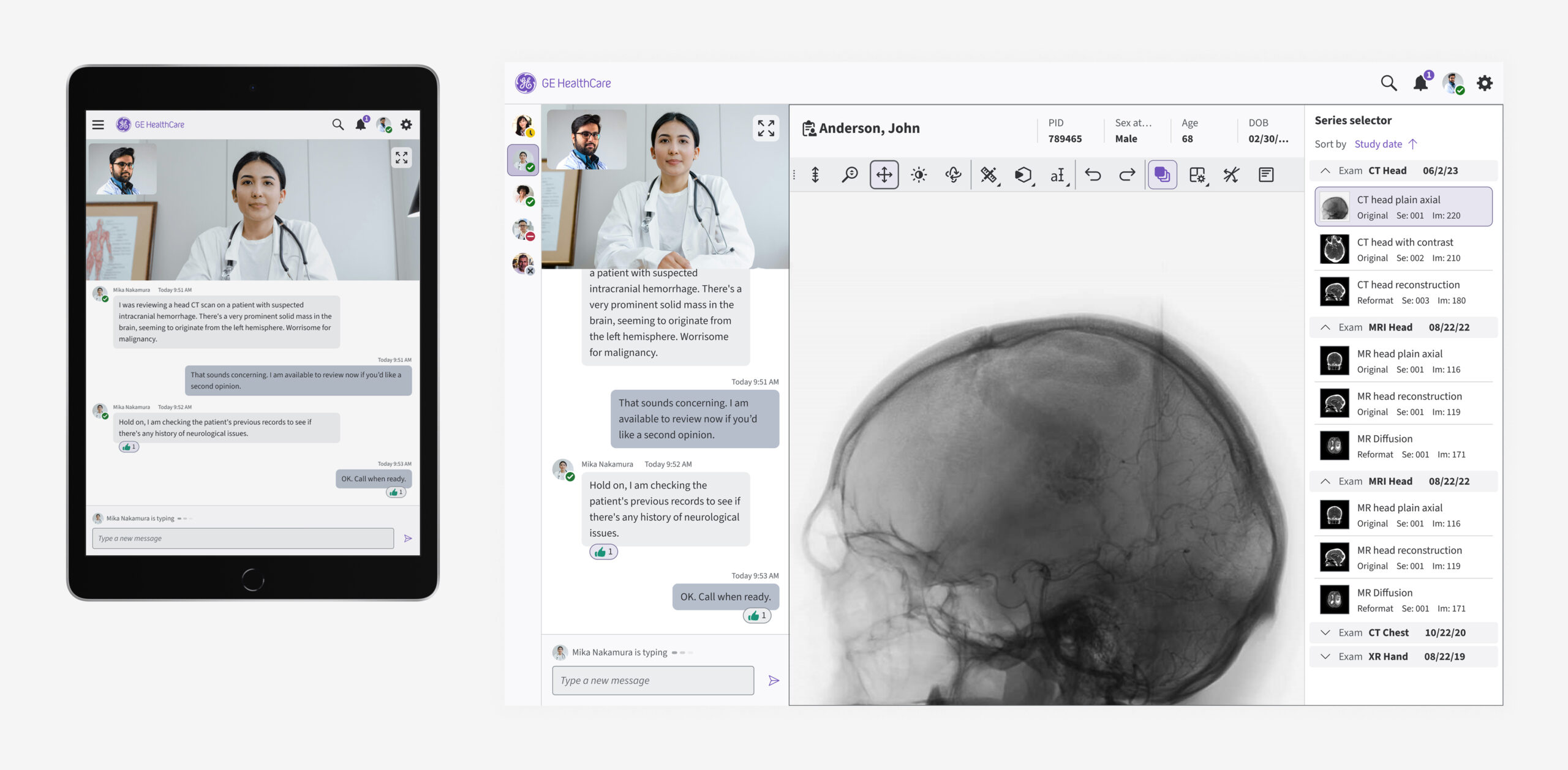
ONE PATIENT, MULTIPLE SCREENS, SEVERAL INTERFACES COMPETING FOR ATTENTION.
Goals
What EDS set out to do
• Surface patterns directly instead of making clinicians hunt for them.
• Design for habit, not exploration: make interaction predictable enough to rely on under stress.
• Make hierarchy do the thinking: show what changed and what matters before anyone has to ask.
• Build trust in the small moments: let consistent color, spacing, and motion remove doubt.
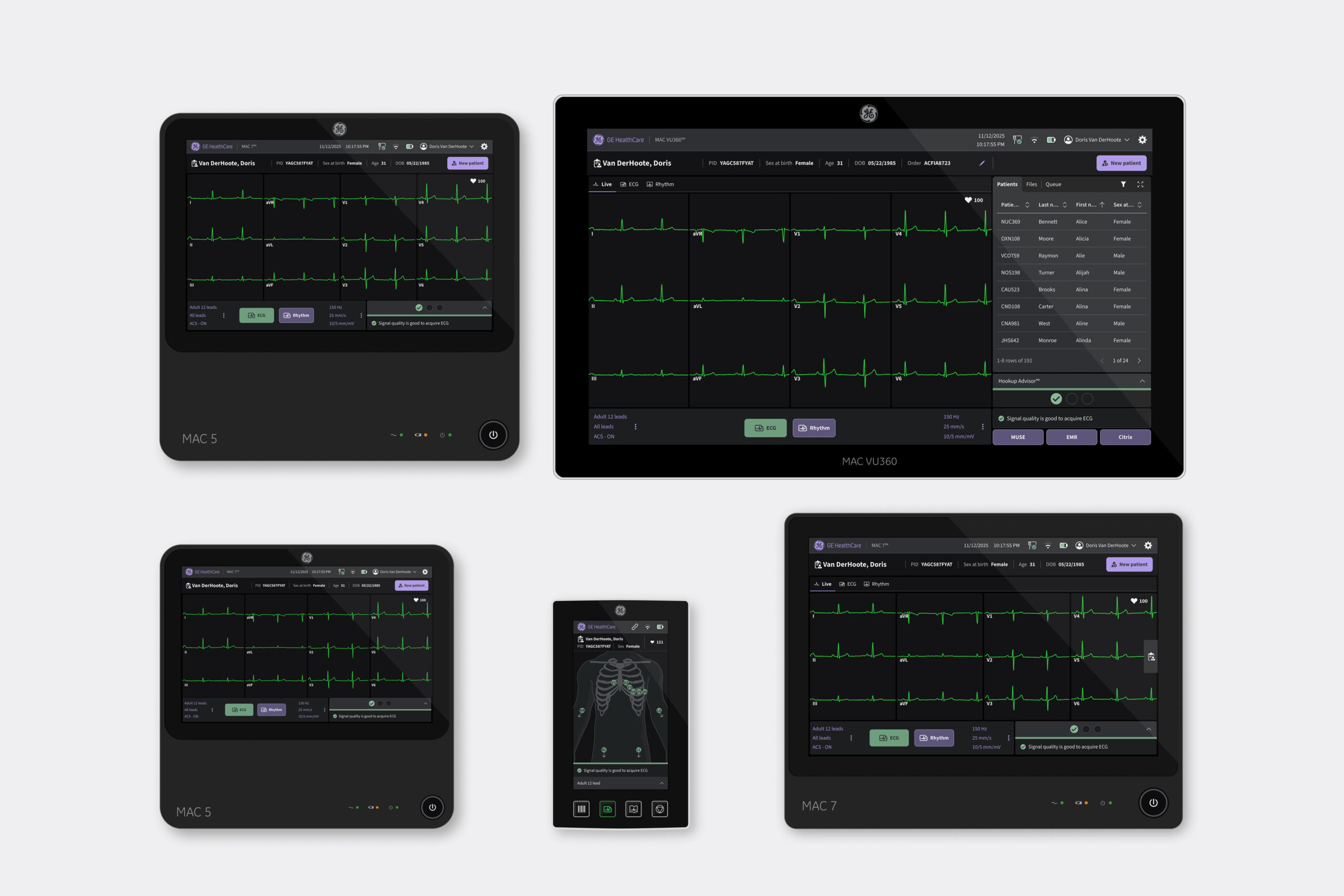
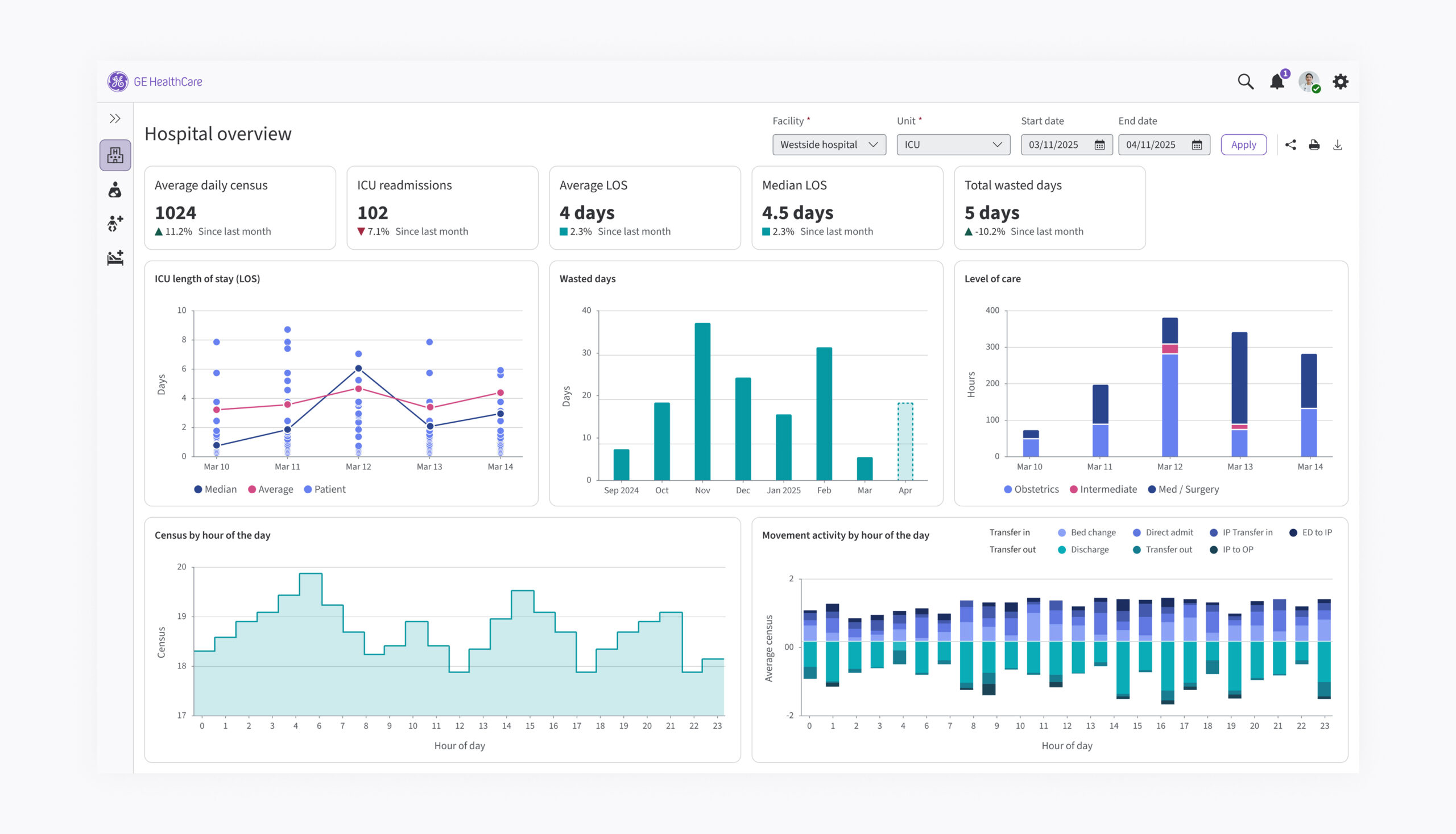
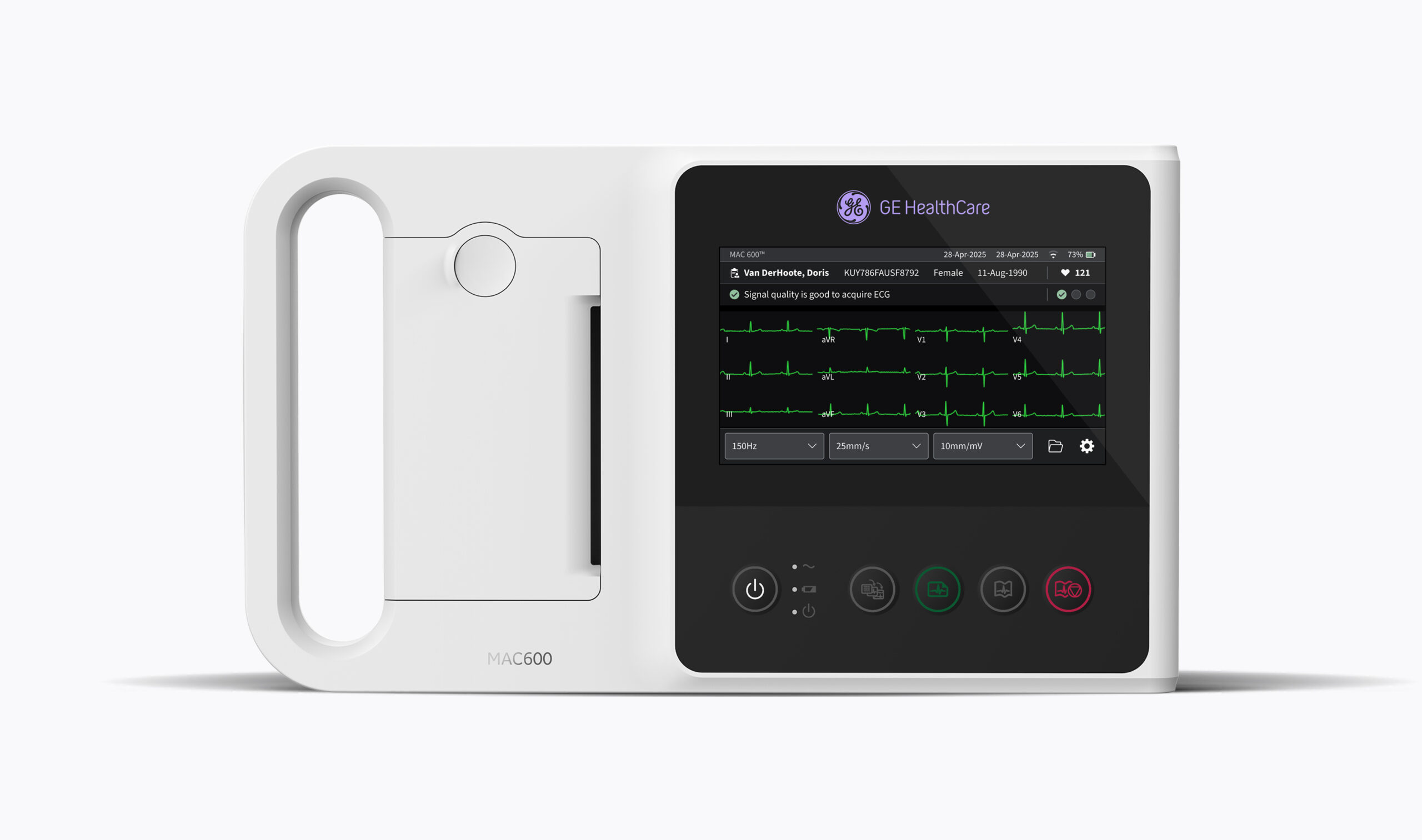
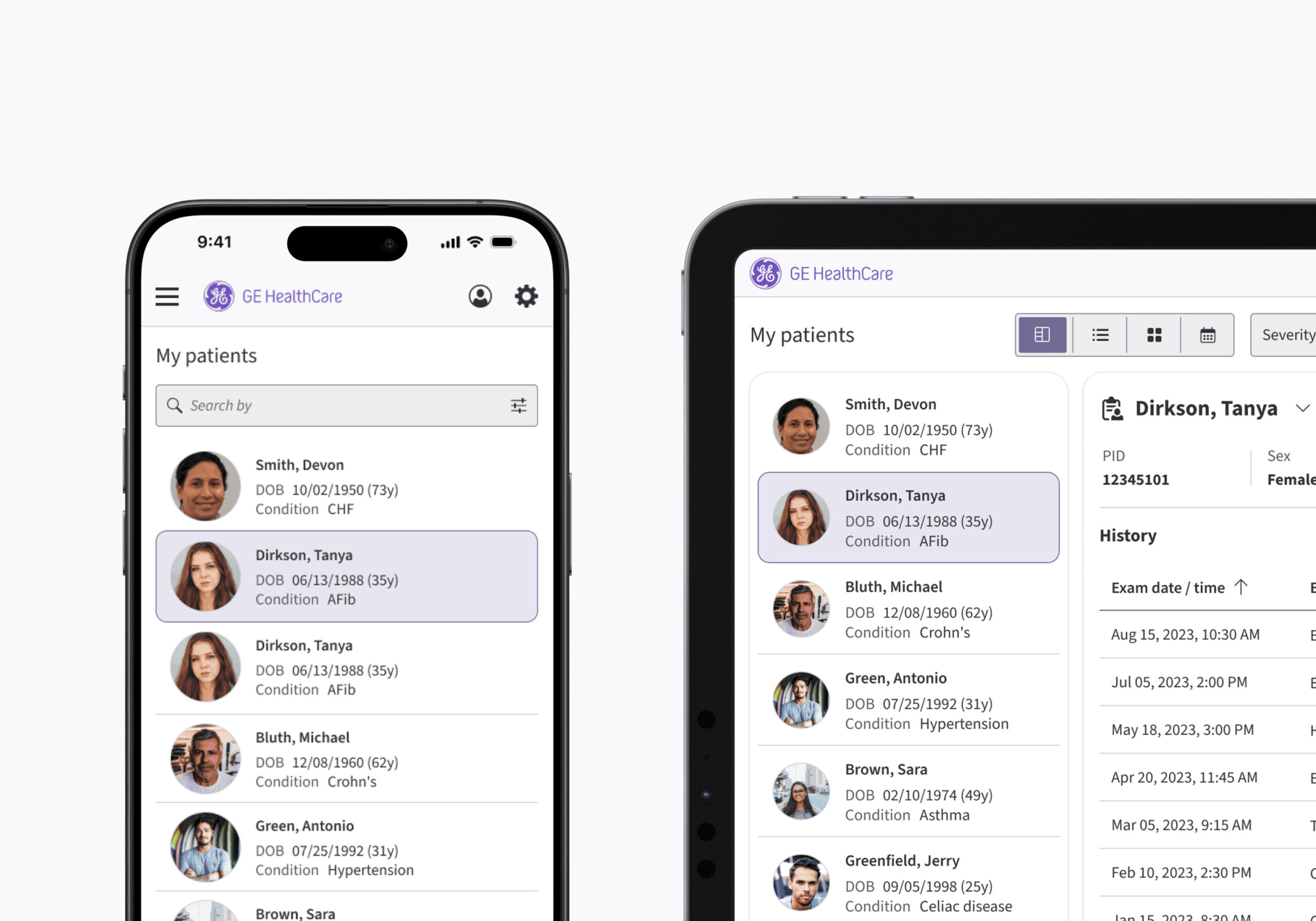
BUILT ONCE, DEPLOYED EVERYWHERE — DESKTOP TO MOBILE, IMAGING TO MONITORING
Strategy and direction
From searching to seeing
The clearest research finding shaping this work was also the simplest: visualization changes everything. Clinicians aren't just reading values off a screen. They're trying to understand a story. Is this patient stabilizing? Is something trending the wrong way? Without visualization, that story gets reconstructed mentally, value by value. With it, the interface tells the story upfront. That single shift, from searching to seeing, became the north star for how EDS approached dashboards, data density, and hierarchy across the entire system.
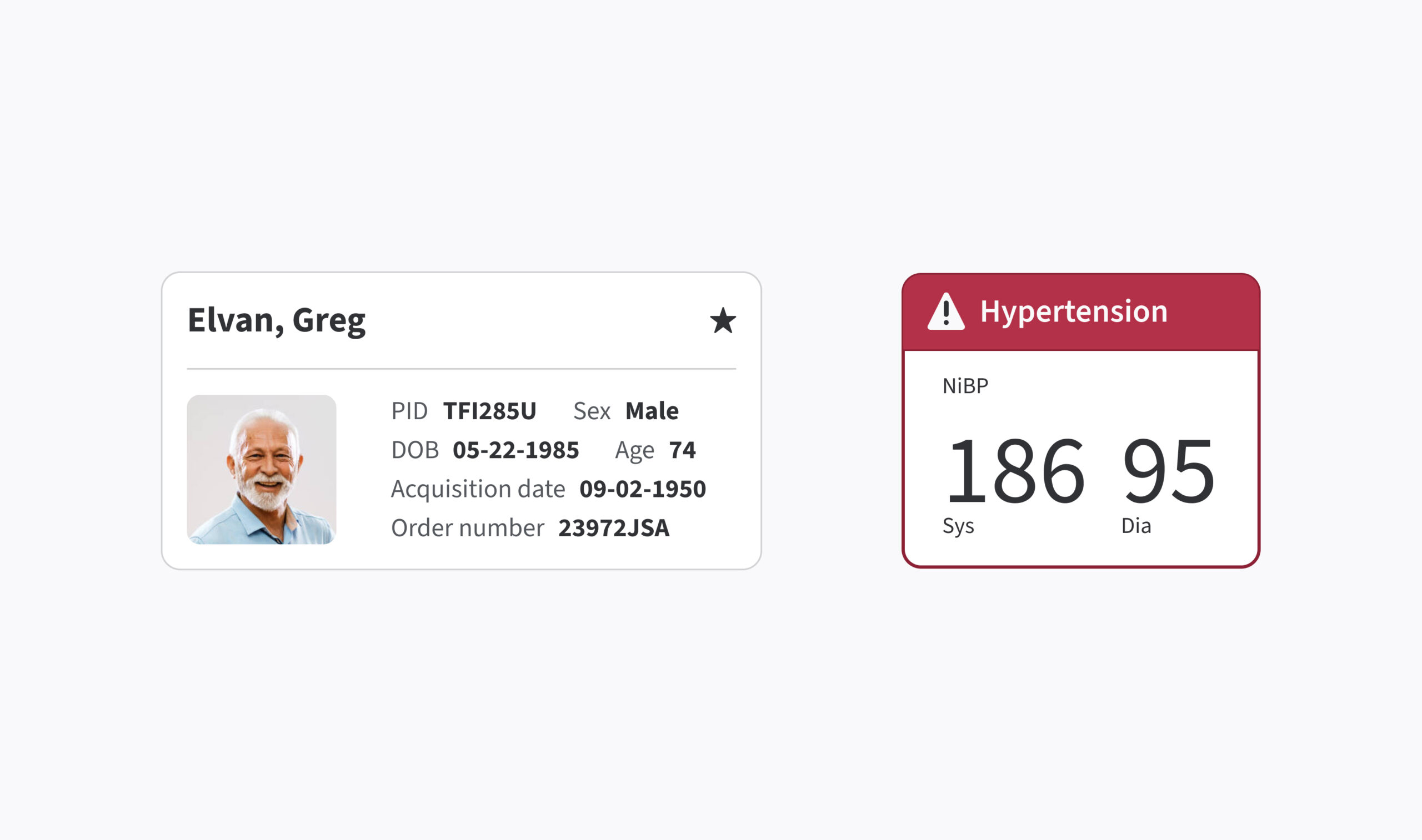
VISUALIZATION CHANGES EVERYTHING.
The second insight came from watching how people actually behave under stress. They don't explore, they rely on habit. A clinician mid-shift expects a button to work the way it worked the last three times. That expectation became the argument for shared pattern libraries, not as a nice-to-have, but as a direct lever on error rates. Once interaction states, transitions, and behaviors stop being open to interpretation, the interface adapts to the user's expectations instead of asking the user to adapt to the interface.
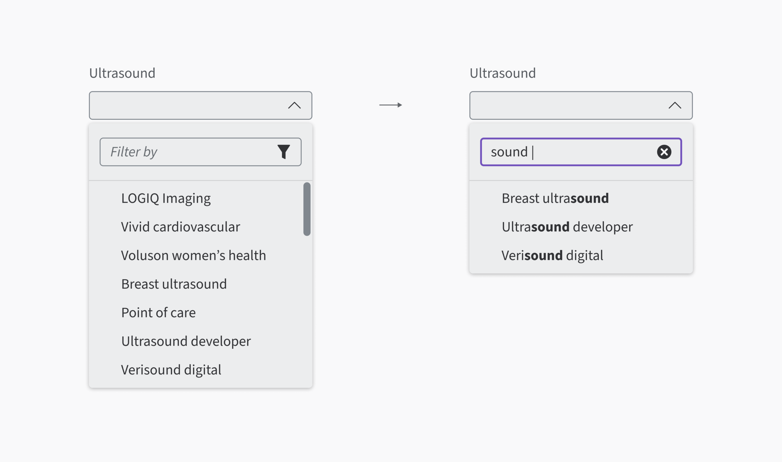
PATTERN LIBRARY AND SHARED GUIDELINES FOR INTERACTIONS STATES, TRANSITIONS, AND BEHAVIORS.
The third thread tied it all together: continuity between the physical and the digital. Clinicians don't think in terms of platforms or systems. They experience one uninterrupted workflow that happens to touch a dozen different screens. EDS was built to erase the seams in that workflow, aligning tokens, interaction states, icons, and motion so a bedside device and a cloud application speak the same visual language without translation.
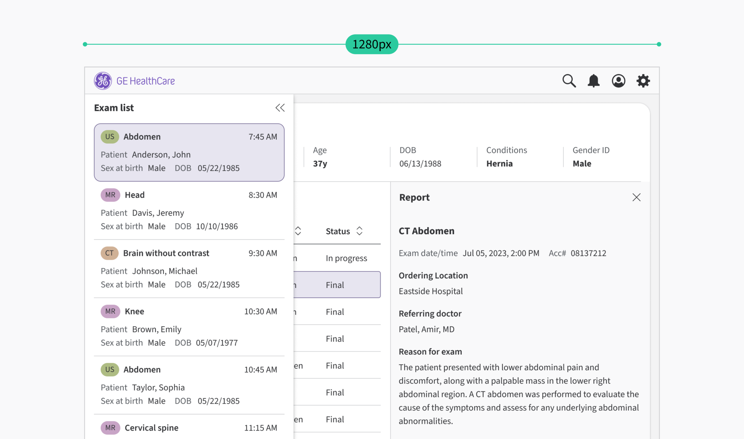
WORKFLOW ADAPTS TO DIFFERENT SCREENS.
Explorations and design decisions
The small decisions that add up
Early decisions centered on what "shared" actually needed to mean for this to hold up in real clinical use, not just in a style guide. A handful of choices ended up defining the system:
Color as semantics, not aesthetics.
Every color tied to severity or state carries specific meaning, so urgency reads instantly rather than being inferred.
Hierarchy engineered on purpose.
Layouts were structured so priority is visually obvious. Without it, everything on screen competes for equal attention, which is its own kind of risk.
Standardized interaction states.
Buttons, feedback, and transitions behave identically everywhere, turning consistency into a direct tool against hesitation.
Micro-interactions built for trust, not polish.
A subtle animation confirming an action removes doubt in a way static feedback can't. These are small decisions with an outsized effect on confidence.
Design tokens as the translation layer.
Color, spacing, and typography lived as tokens rather than fixed values, so intent moves from design to code without ambiguity, and themes like dark mode adapt without a redesign.
Multi-input and multi-environment support from day one.
Every component was built to handle touch, mouse, keyboard, and gloved input, because clinical hardware varies wildly by department and by hour.
Legibility engineered for worst case, not best case.
Typography was tested against the conditions that actually break it: a dim ICU at 2 AM, a fluorescent-lit or at noon, a glance from three feet away mid-procedure. Every type scale and contrast ratio holds up against WCAG 2.1 AA, so accessibility isn't a compliance checkbox bolted on at the end. It's load-bearing.
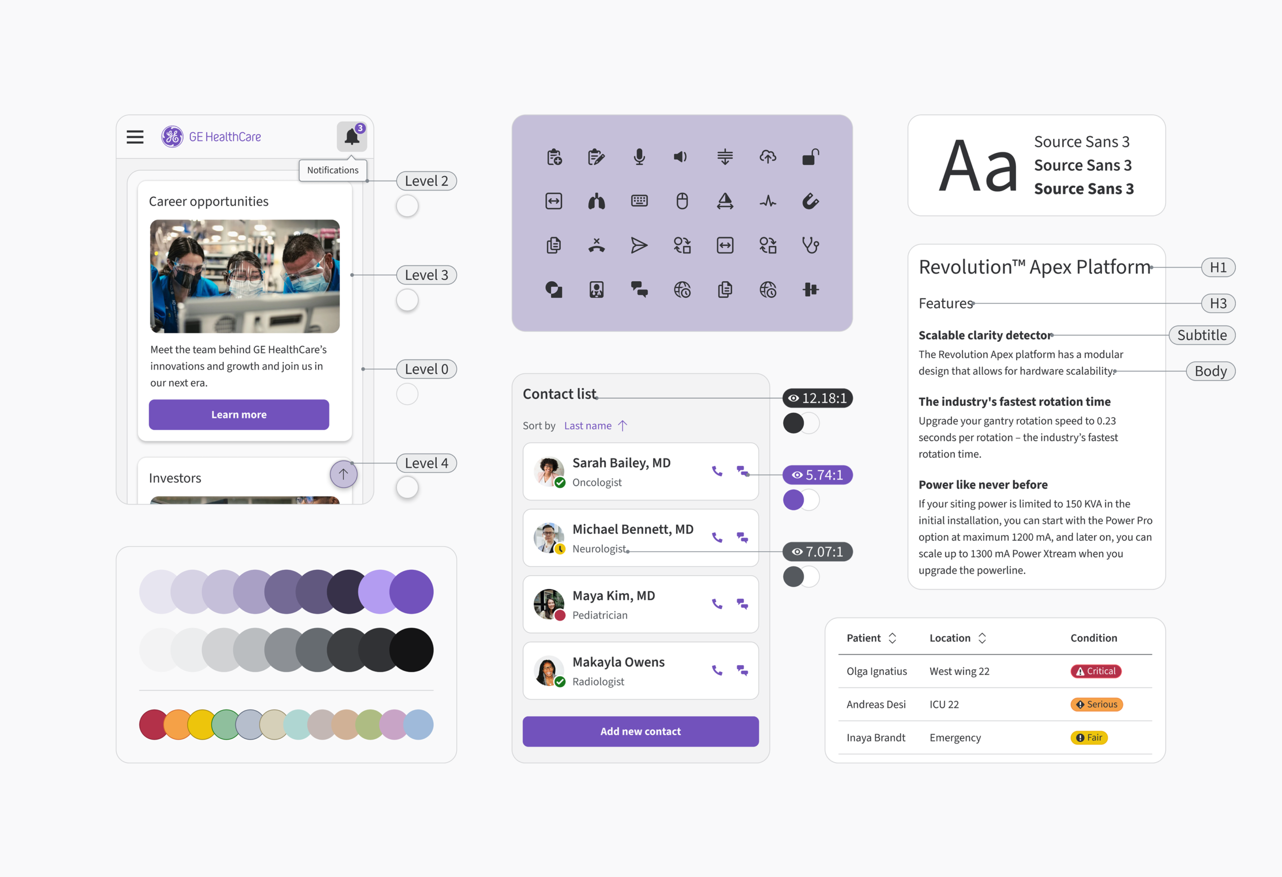
EDS FOUNDATION
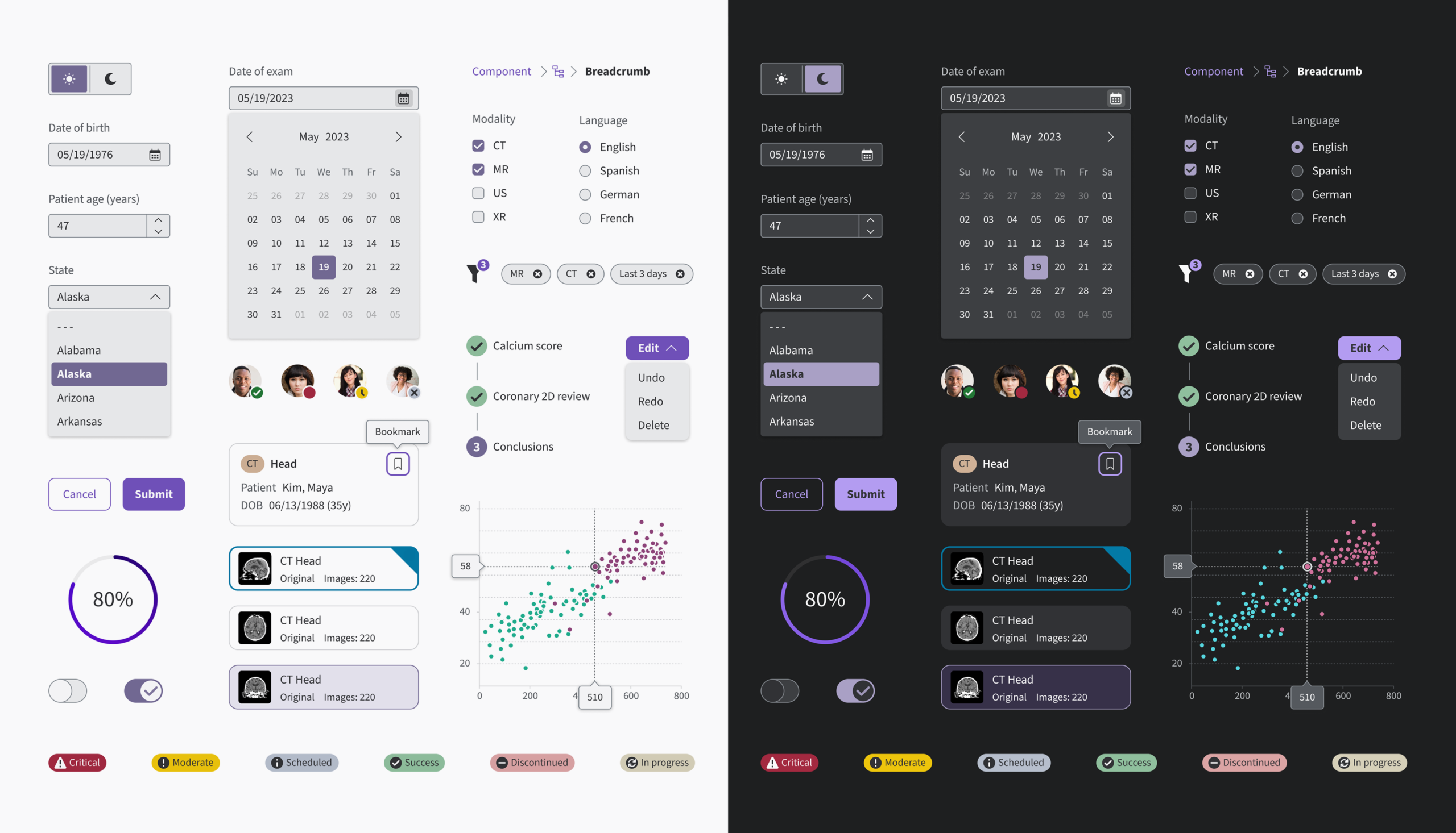
EDS LIGHT AND DARK COMPONENTS

INDICATOR GRADIENT
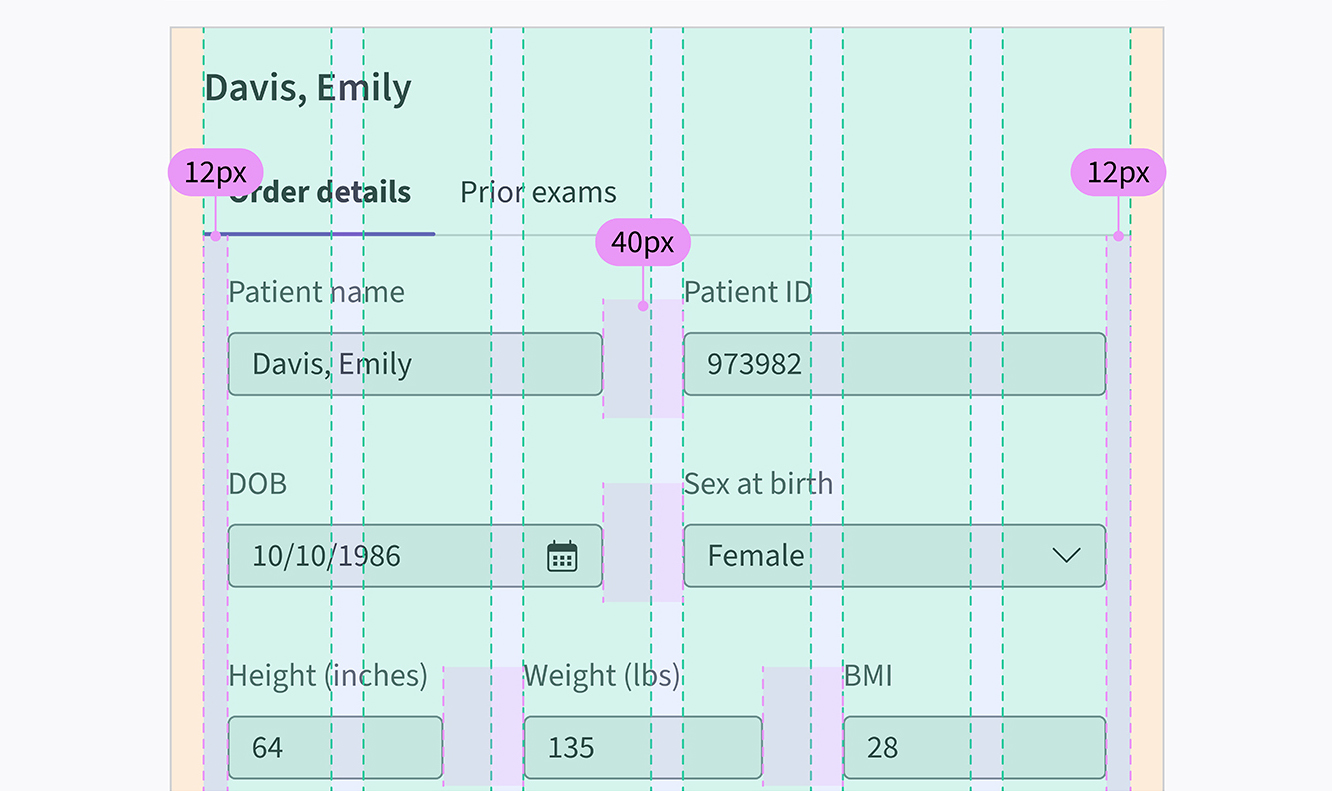
DESIGNING ON GRID
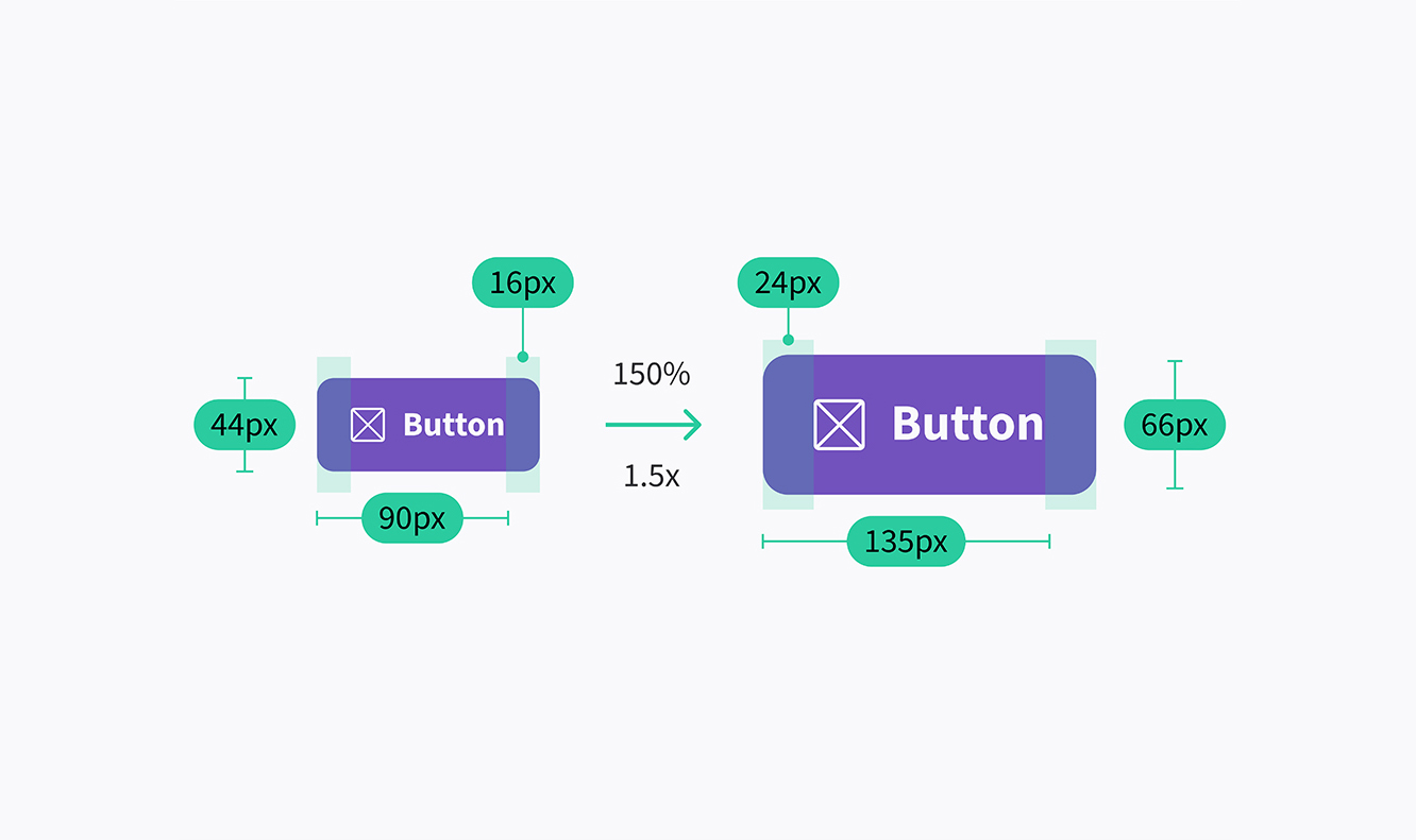
SCALLING
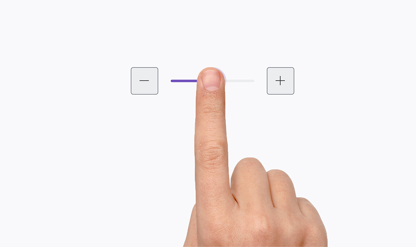
GESTURES
INTERACTIONS
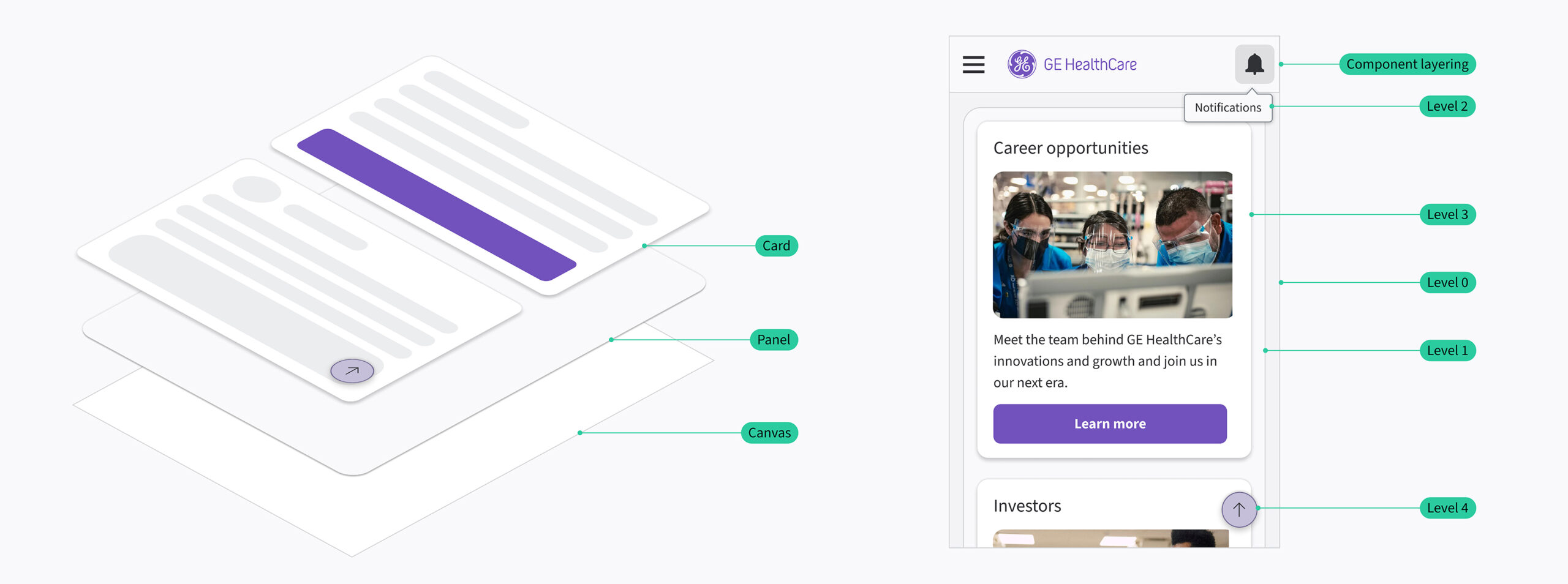
ELEVATION
The solution
One language, every screen
EDS today is a shared foundation of more than 1,000 Figma components and 50-plus coded components with 400-plus variants, all built on the same token system and validated against WCAG 2.1 AA. But the number that matters more is harder to quantify. A clinician moving from a monitoring dashboard to a diagnostics tool now finds the same logic waiting for them. Buttons behave the same way. Alerts read the same way. Hierarchy tells them what matters before they have to ask.
That continuity is the whole point. The system was never meant to be noticed. It was meant to disappear into the workflow, doing its work quietly in the moments when a clinician has no attention to spare on figuring out an interface. When it works, nobody thinks about the design at all. They just move faster, with less doubt.
For the teams building on top of EDS, the tax of reinventing typography, contrast, and interaction from zero disappeared. What they inherited instead was a system already tested against real clinical behavior, freeing their time for the specific, harder problems each product actually needed to solve.
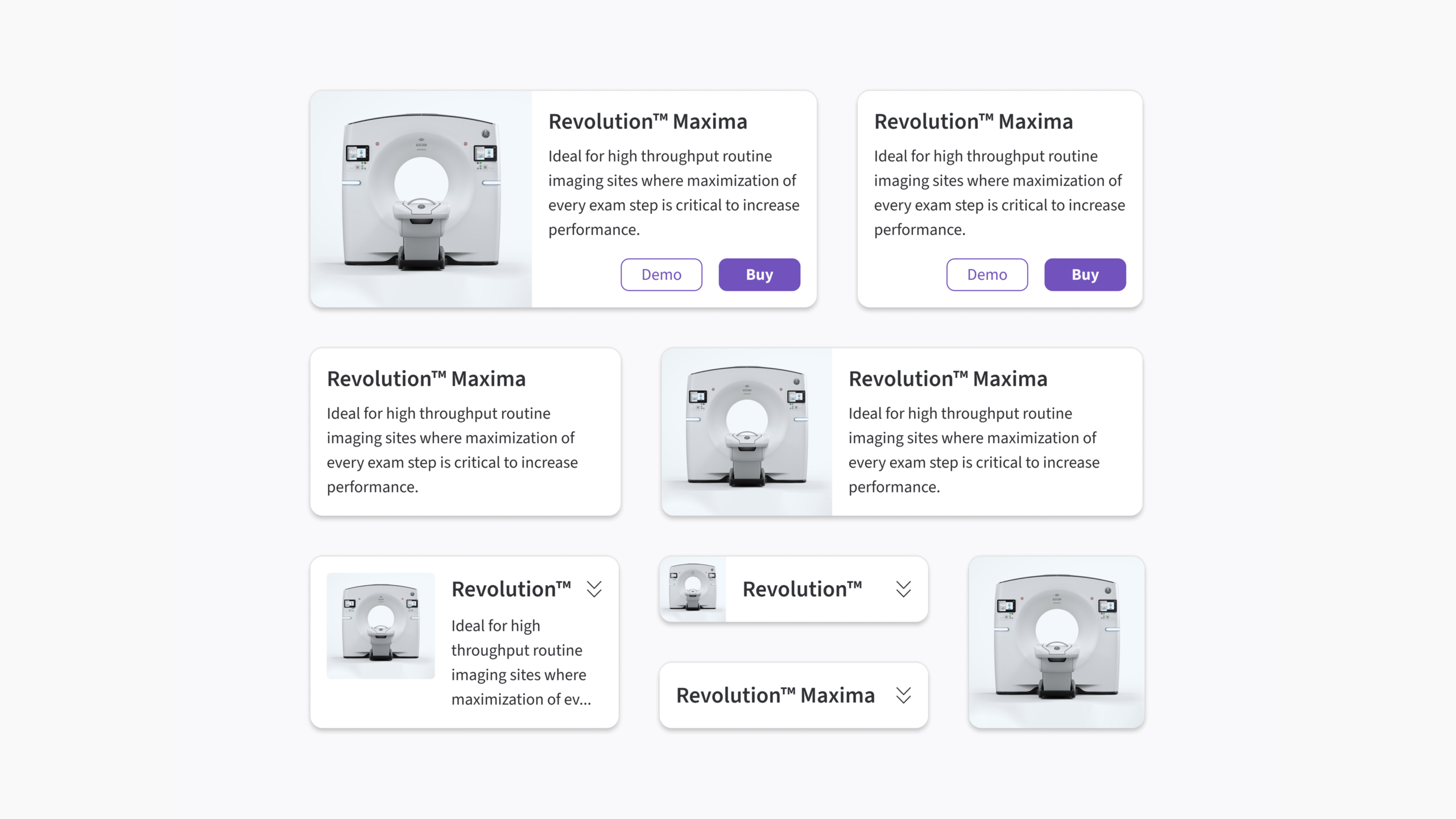
CARD COMPONENT
ONE SYSTEM, EVERY LAYOUT.
Impact
Beyond the metrics
In its first year, EDS was adopted across 36-plus teams and 13-plus products, generating more than 100,000 monthly component instances in production. GE HealthCare estimates the system delivered over $8 million in efficiency value in that span, with some teams cutting development timelines by as much as nine months.
But the number worth sitting with isn't a dollar figure. It's the shift in what design and engineering stopped arguing about. When a component in Storybook is the same component in Figma, teams stop negotiating over interpretation gaps and start contributing back to the system itself. EDS moved from a top-down initiative to something closer to shared infrastructure people had a stake in improving.
What this project proved, more than any metric, is that the "life-saving pixel" isn't a metaphor. It's the accumulation of thousands of small, intentional decisions: a color, a spacing value, a consistent transition, each one reducing friction at a moment when friction has a real cost. Done well, that kind of design becomes almost invisible. But it shows up anyway, in faster decisions, in fewer errors, and ultimately, in better care.
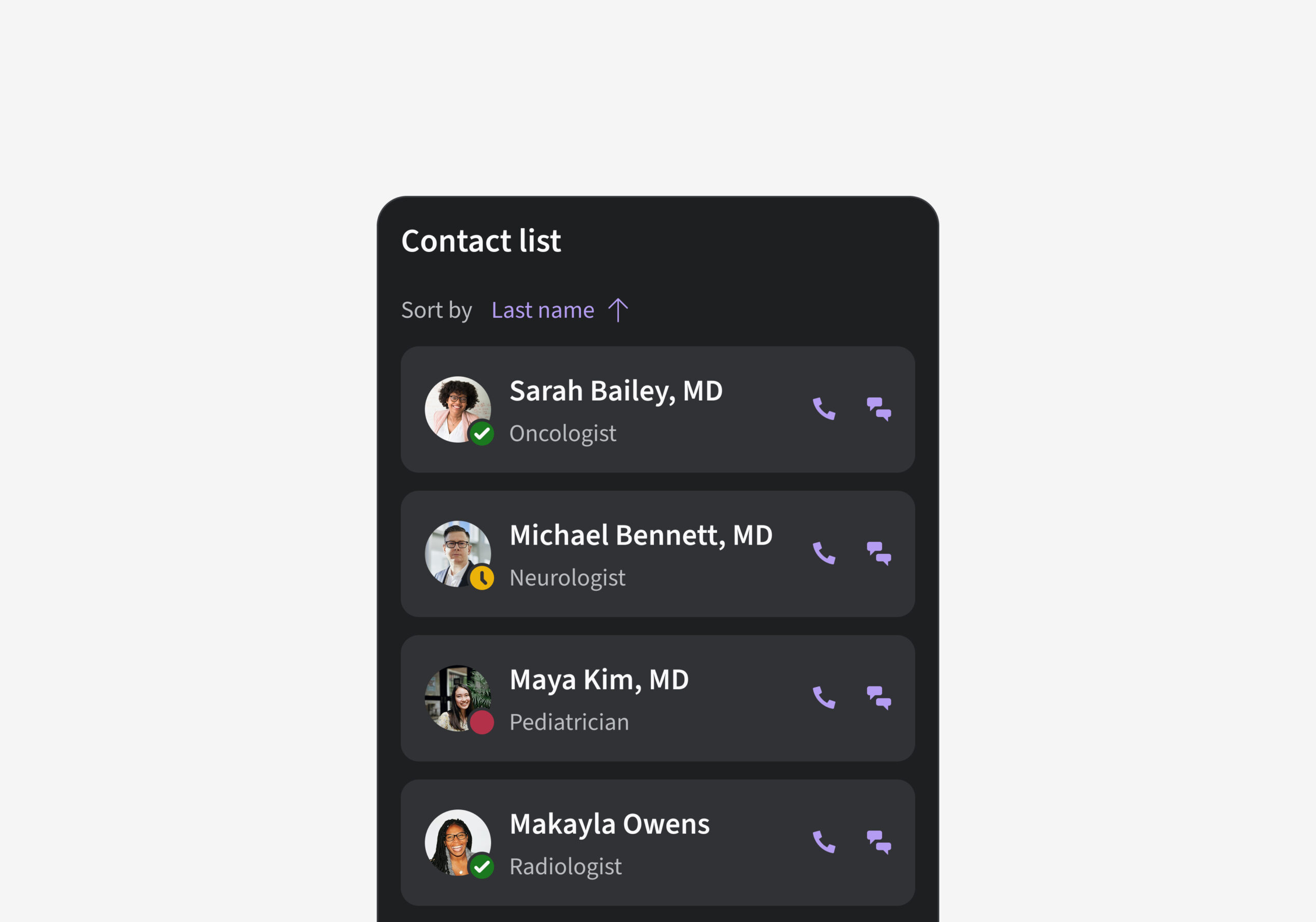
AWARDS
EDS picked up recognition across four juries in its first year, spanning communication design, product design, and measurable business impact.