Ciclus
A soap that not only cleans but also cares.
Ciclus, a startup dedicated to producing liquid and bar soaps derived from fruit peels without artificial dyes, embodies a commitment to both environmental preservation and consumer affordability. The brand's genesis lies in a meticulous naming process, culminating in 'Ciclus,' evoking a sense of recycling as the driving force behind the brand identity.
Solution
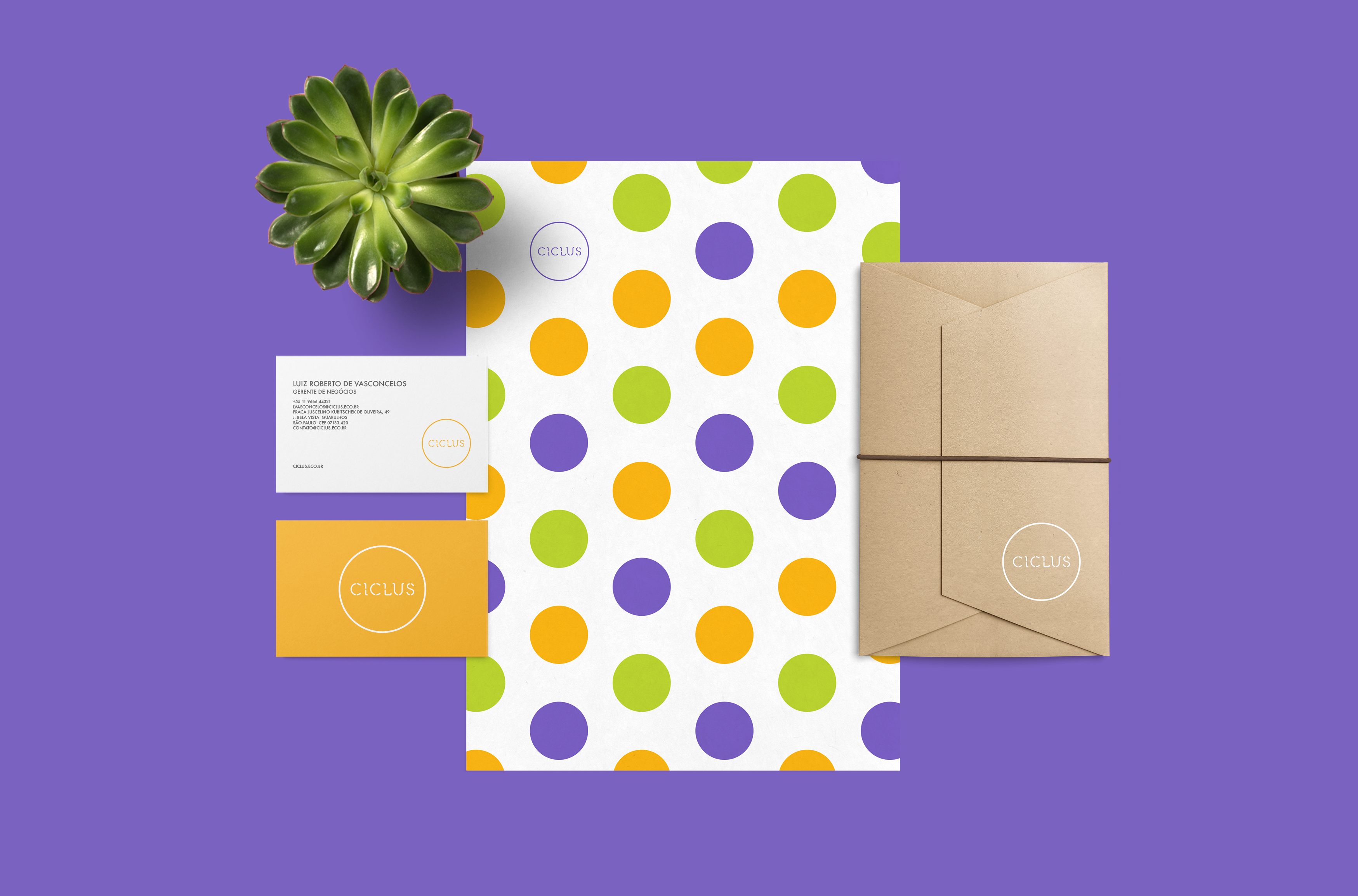
A central element, the solid circle in Ciclus' visual identity, symbolizes the seamless integration of all production cycle steps, from raw material acquisition to product disposal, underscoring company’s sustainability ethos.
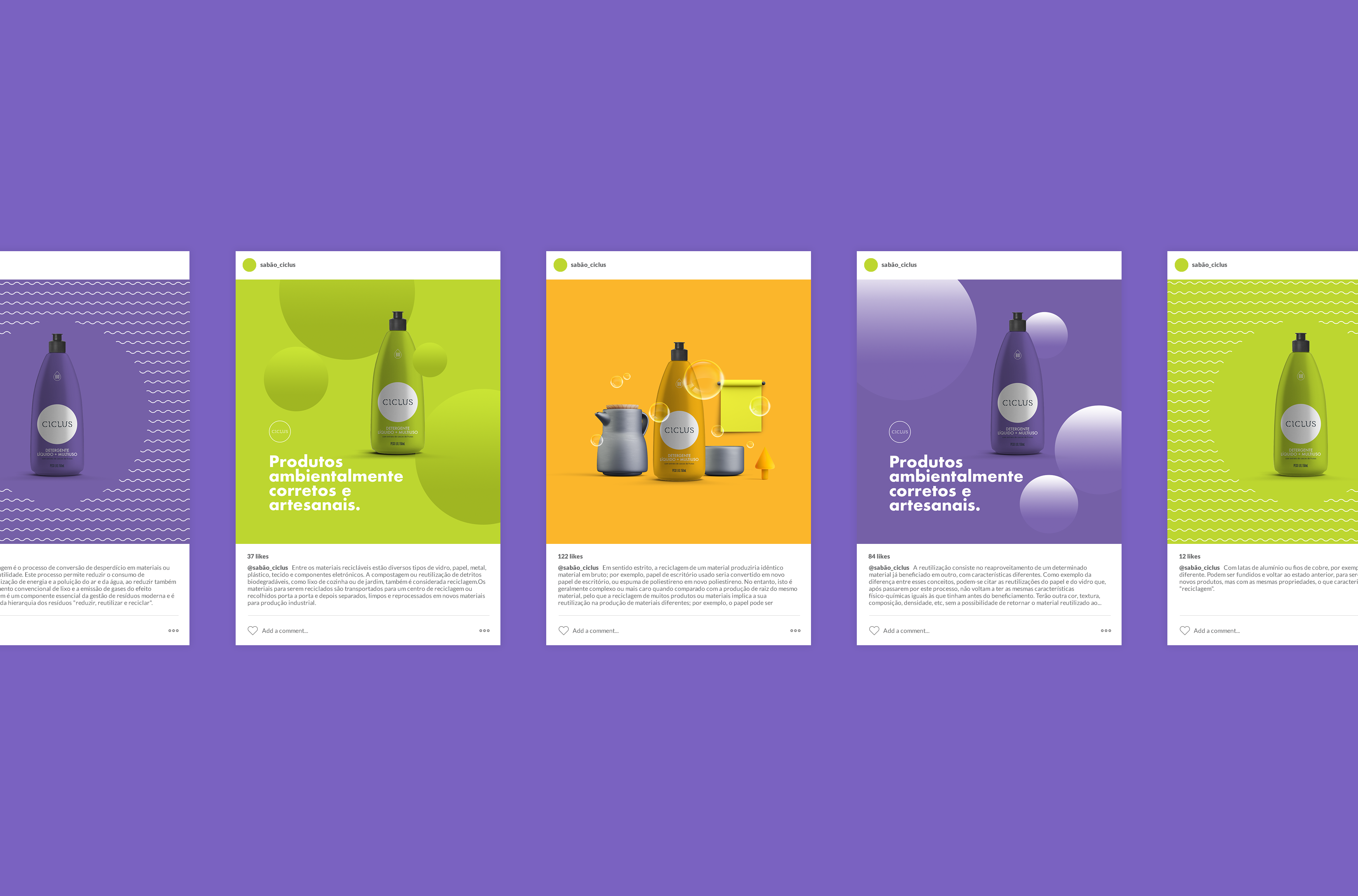
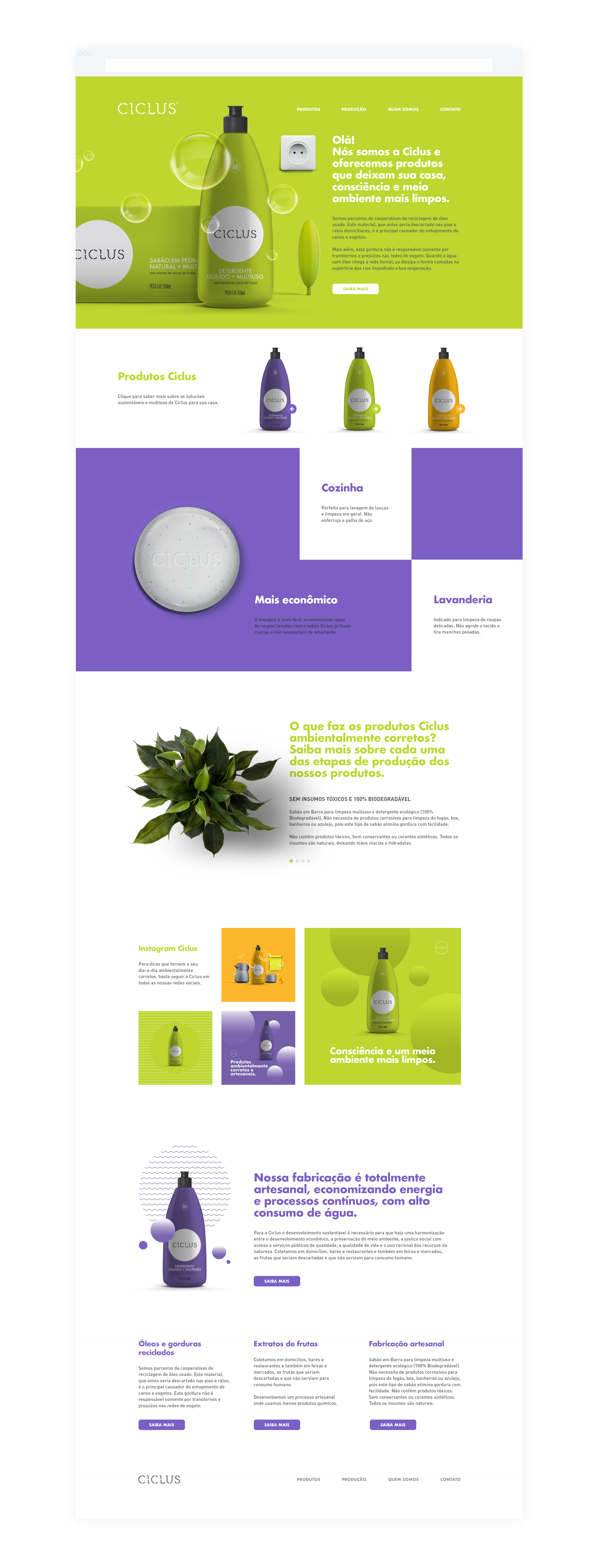
While rooted in natural origins, Ciclus diverges from the traditional ecological look. The proposed design exudes an alternative lifestyle and youthful language, subtly incorporating ecological concepts. From name selection to color choices, every decision aims to convey sustainability without overshadowing other benefits like a more joyful life and a better world.
Through a deliberate use of a bold color palette and the incorporation of everyday objects, Ciclus adopts a graphically relaxed yet professional approach, differentiating itself from competitors. The unconventional color combination, while daring, maintains design clarity, positioning Ciclus as a product of higher quality and value.
Results
Ciclus is now standing tall as an affordable and superior-quality product, seamlessly merging consumer well-being with environmental responsibility. The strategic use of color and humor sets the brand apart, placing Ciclus in an exclusive tier within the market. This approach not only distinguishes the company from competitors but also underscores their commitment to a sustainable future.


